SOLAR HOME ENERGY
category:
UX Design
services:
Design
team:
Designer - Sarin Kunjappan
UX Case Study
A Concept Project for a Residential Solar Monitoring System
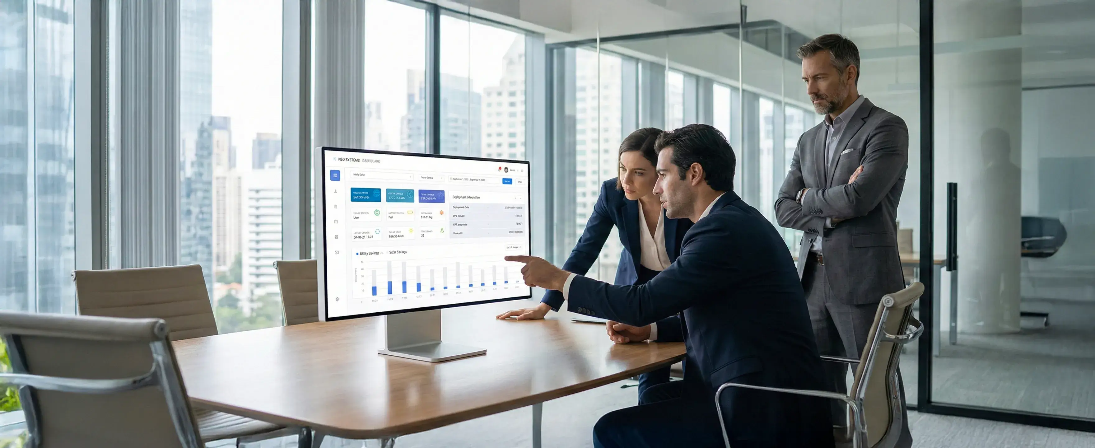
This concept project explores a modern, intuitive dashboard designed for home users to monitor and manage their residential solar energy systems. The goal was to simplify complex solar data—battery usage, solar yield, device status, voltage trends, and notifications—into a clean, accessible interface that empowers users to understand their home’s energy performance at a glance.
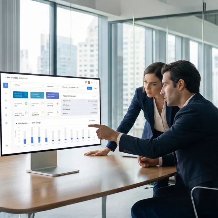
Dashboard Overview & System Summary
Designing Clarity for Everyday Solar Users
Summary
Challenge
Solution
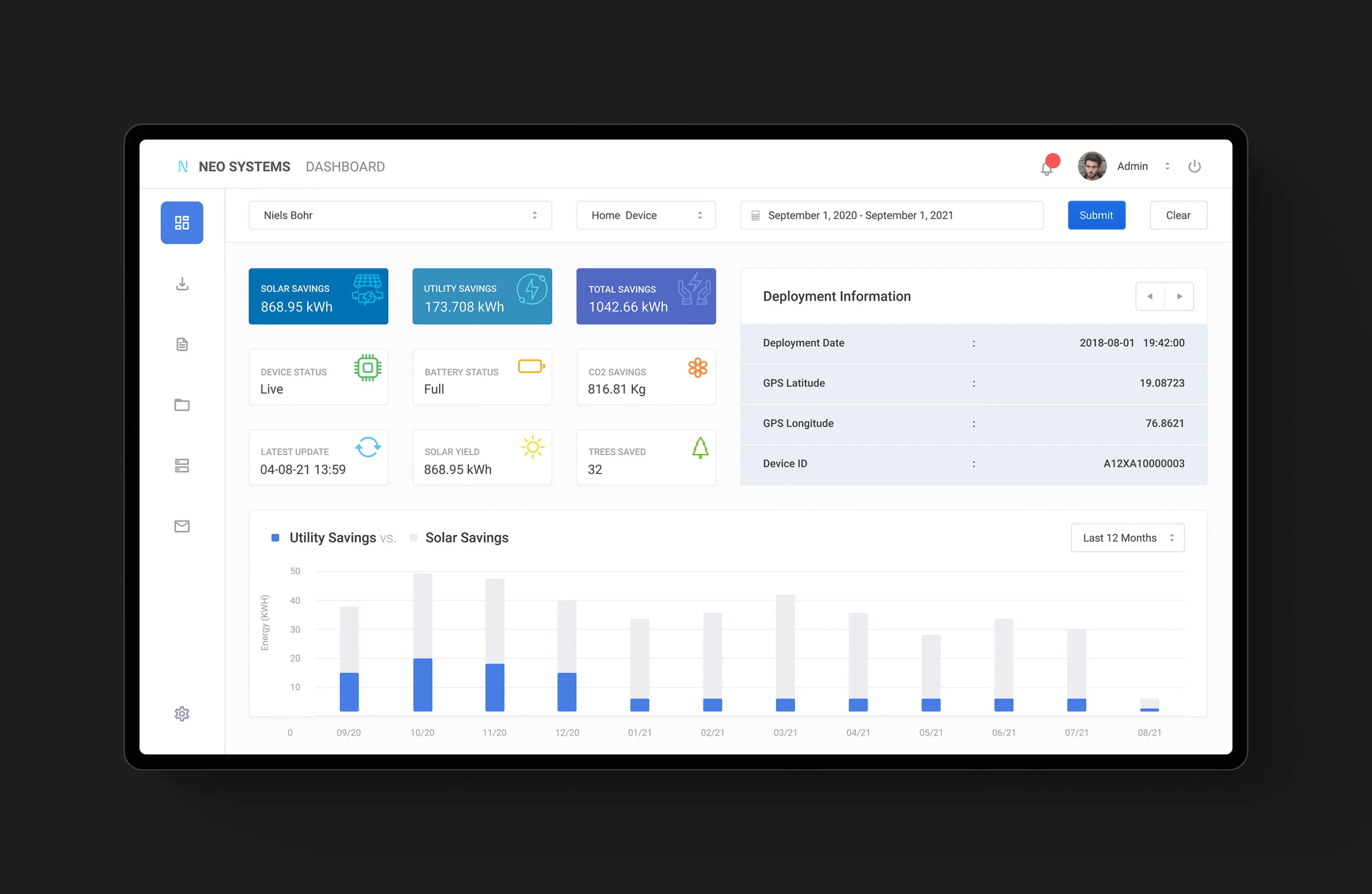
The first screen sets the foundation for the entire experience: giving homeowners a quick, confident understanding of how their solar system is performing. Instead of overwhelming users with technical jargon, the dashboard distills the essentials into clean summary cards—solar yield, utility savings, CO₂ reduction, battery status, and device health. These insights sit alongside deployment information for complete system transparency. A simple comparison chart of Solar vs. Utility Savings helps users immediately grasp the value their system delivers month after month.
Early research revealed that most home users struggled to translate complex solar metrics into meaningful insights. Traditional dashboards surfaced too much raw data, forcing users to interpret kilowatt-hours, device values, and battery indicators without context.
The redesign placed emphasis on readability and hierarchy. High-value insights were elevated into a structured card layout, supported by intuitive iconography and consistent visual language. The savings chart was simplified to a format that even non-technical users could interpret instantly. The result is a calm, accessible overview that empowers homeowners instead of confusing them.
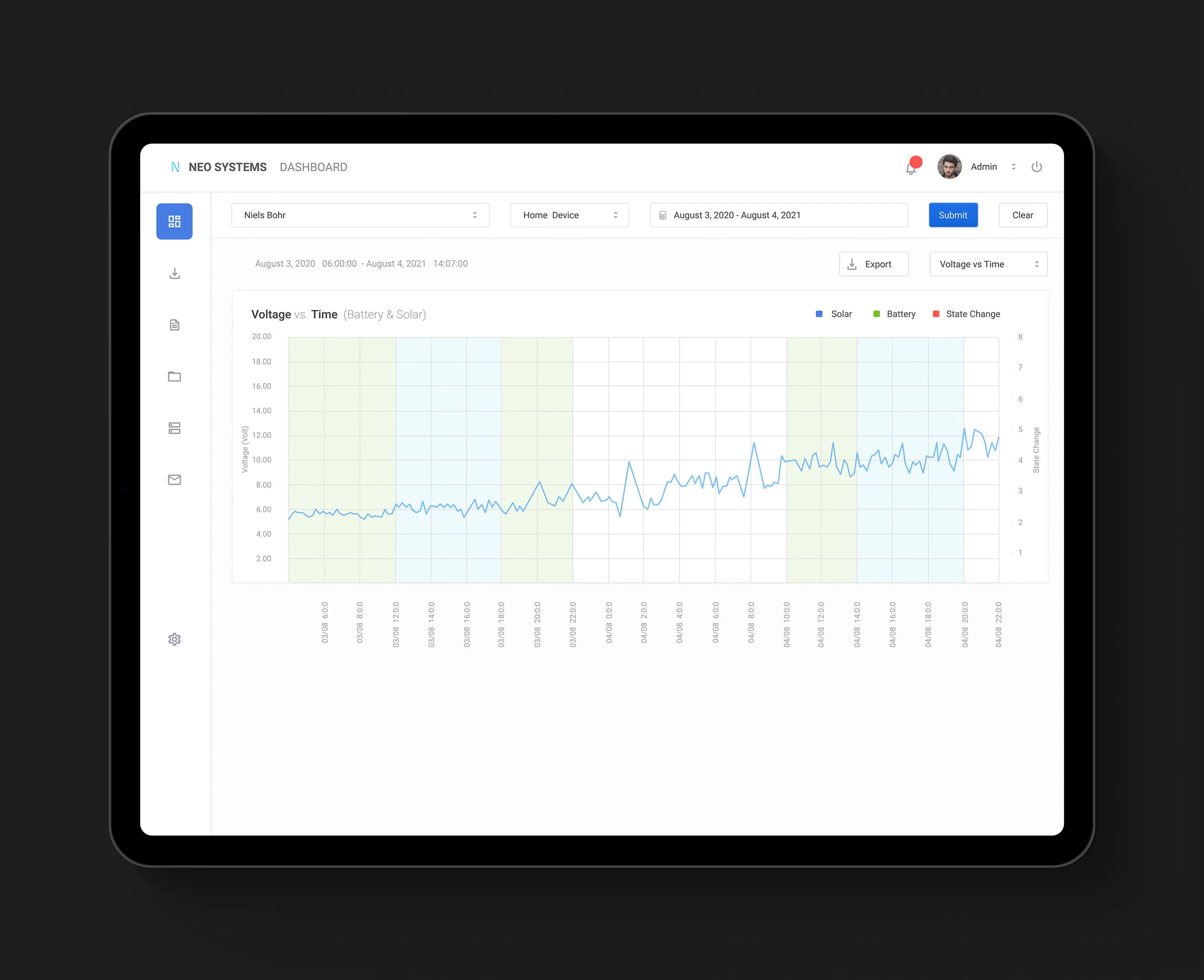
Voltage & Performance Trends Over Time
Making Technical Data Understandable at a Glance
Summary
Challenge
Solution
Voltage patterns are critical to understanding solar performance—but also one of the most intimidating elements for everyday users. This screen transforms a typically technical graph into an approachable, insight-driven visualization. The Voltage vs. Time chart reveals how the system behaves throughout the day, enhanced with color-coded time segments that map naturally to morning, afternoon, and evening. Date ranges and filters allow deeper exploration without overwhelming the user.
Users found raw voltage charts difficult to interpret, often missing performance dips or misreading normal fluctuations as system issues. The lack of context around timing made it even harder for them to understand why these changes occurred.
By introducing time-segment backgrounds, clean grid structures, and clearly differentiated solar and battery lines, the visualization became more narrative and intuitive. The graph now tells a story—guiding users to recognize patterns, notice trends, and connect system behavior to real-world time periods. This transforms technical performance data into actionable understanding.
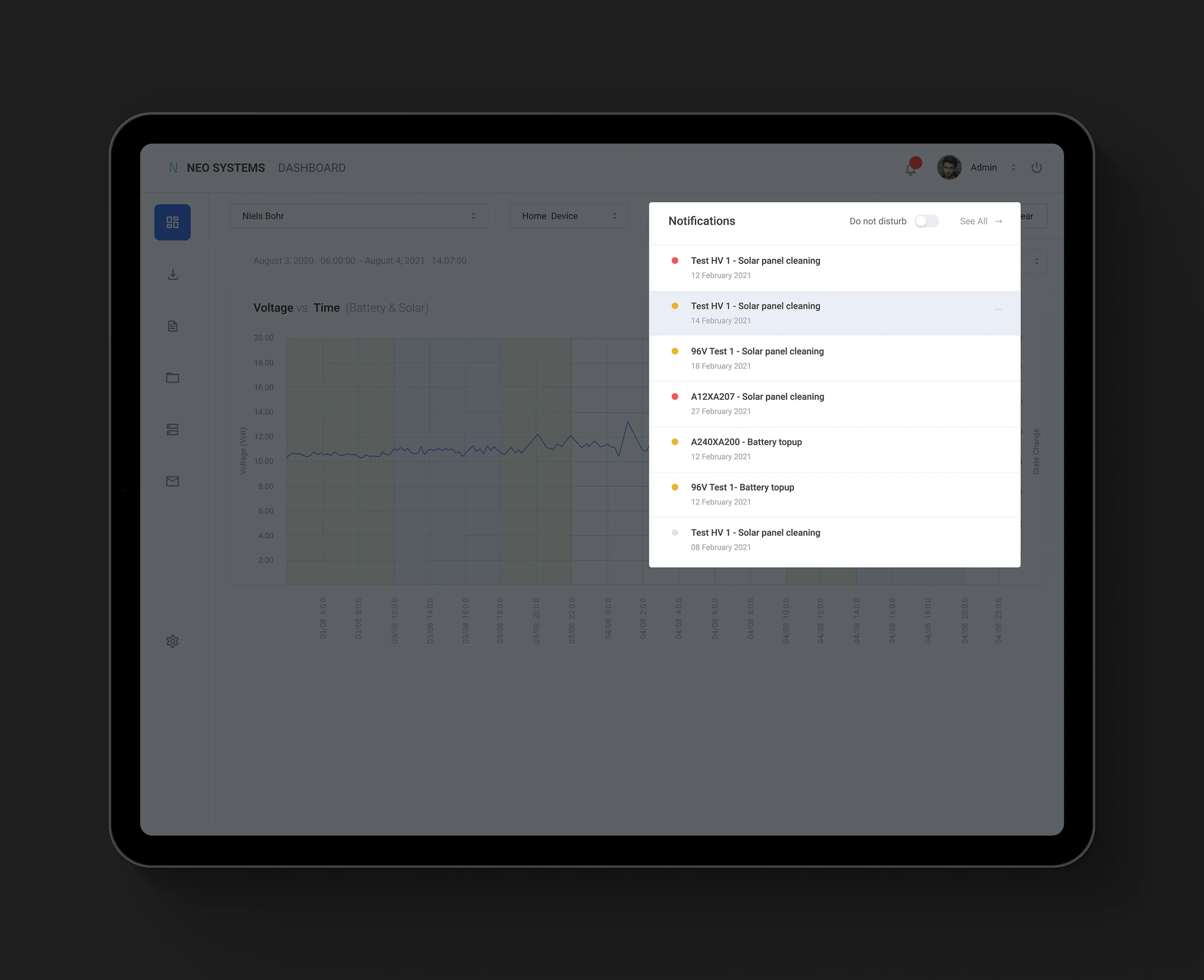
Smart Notifications & Maintenance Alerts
Keeping Users Informed Before Problems Happen
Summary
Challenge
Solution
Maintenance is a crucial but often overlooked part of home solar management. The notifications panel was designed to proactively surface everything users need to know—whether it’s cleaning panels, topping up a battery, or addressing performance anomalies. The slide-out drawer format ensures alerts are visible yet non-disruptive, allowing users to stay within their workflow while still being informed.
Users frequently missed important maintenance tasks because alerts were buried inside system menus or phrased in technical terminology. This led to reduced efficiency and system underperformance, often discovered only after issues escalated.
A dedicated, elegantly structured notifications drawer was introduced—featuring severity indicators, clear labeling, and human-friendly wording. By presenting information in a timely, digestible manner, users gain confidence in managing their system and can take action before small issues turn into service calls.