
MEDTRACK
MedTrack: Designing a Medication Management Experience That Improves Adherence and Patient Confidence
Completed as part of the Google UX Design Professional Certificate, focusing on digital healthcare solutions and user-centered design methods.
Executive Summary
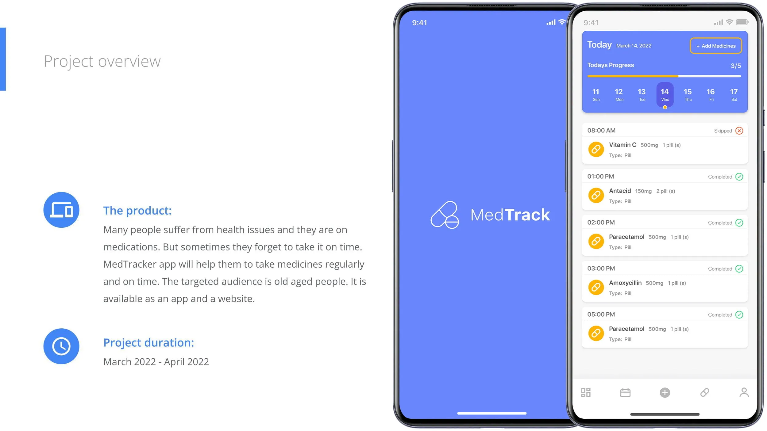
MedTrack is a conceptual mobile healthcare application developed as part of the Google UX Design Professional Certificate. The project explored how user-centered design could help patients manage medications more effectively by improving medication adherence, reducing missed doses, and simplifying prescription tracking.
Managing multiple medications can quickly become overwhelming, particularly for patients with chronic conditions, older adults, and caregivers. Missed doses, confusing schedules, and limited visibility into medication history can negatively affect treatment outcomes.
The objective of MedTrack was to create a simple, accessible, and trustworthy mobile experience that helps users organize medications, receive timely reminders, track adherence, and access prescription information from a single interface.
The project followed a complete UX process, including user research, competitive analysis, personas, journey mapping, information architecture, wireframing, interactive prototyping, usability testing, and iterative improvements.
Although conceptual, MedTrack strengthened my understanding of healthcare UX by demonstrating how thoughtful interaction design can reduce cognitive load and improve confidence when managing everyday health routines.
Project Context
This project was completed as part of the Google UX Design Professional Certificate.
The objective was to demonstrate an end-to-end UX design process by addressing a real-world healthcare challenge using research-driven design methods and iterative validation.


The Problem
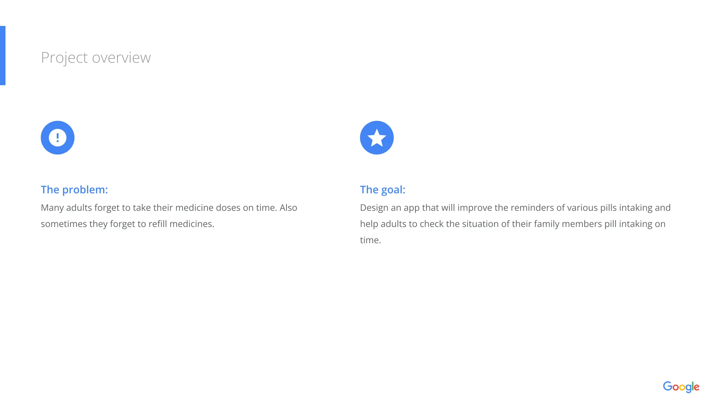
Medication management is often more complicated than patients expect. These challenges become even greater for older adults and individuals managing chronic illnesses.
Common User Struggles
The goal was to design a mobile application that reduces these everyday frustrations while helping users stay consistent with their treatment plans.
Design Challenge
The project focused on improving five key areas to create a reliable and intuitive healthcare experience.
Help users remember medications through clear reminders and scheduling.
Provide an organized view of medications, dosages, and schedules.
Present health information clearly without overwhelming users.
Help users understand what to take, when to take it, and what has already been completed.
Design an experience that is simple, readable, and easy to use for a broad range of users.
Project Goals
The experience was designed around core pillars to ensure clarity, trust, and usability.
My Role
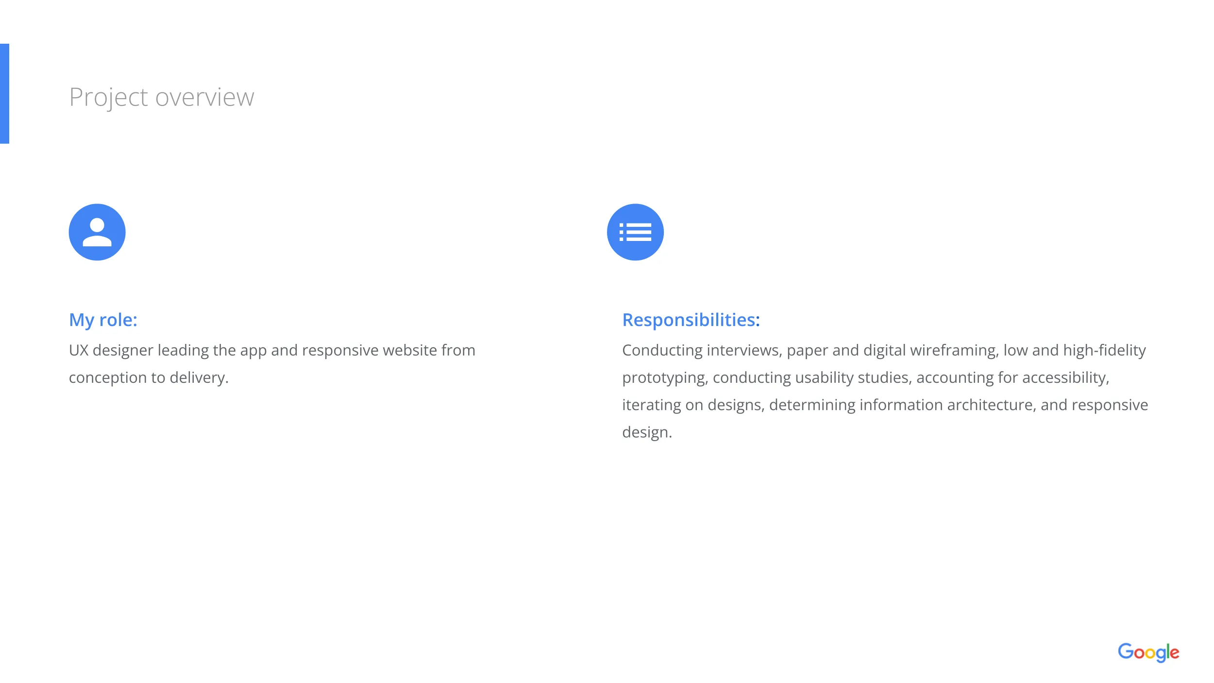
As the UX Designer, I completed the full design lifecycle from initial research to iterative usability validation.
Design Process
The project followed a rigorous, user-centered framework to ensure every stage of development was guided by user feedback and usability validation.
Each phase built directly upon prior findings, turning initial insights into a polished, accessible healthcare experience.
User Research
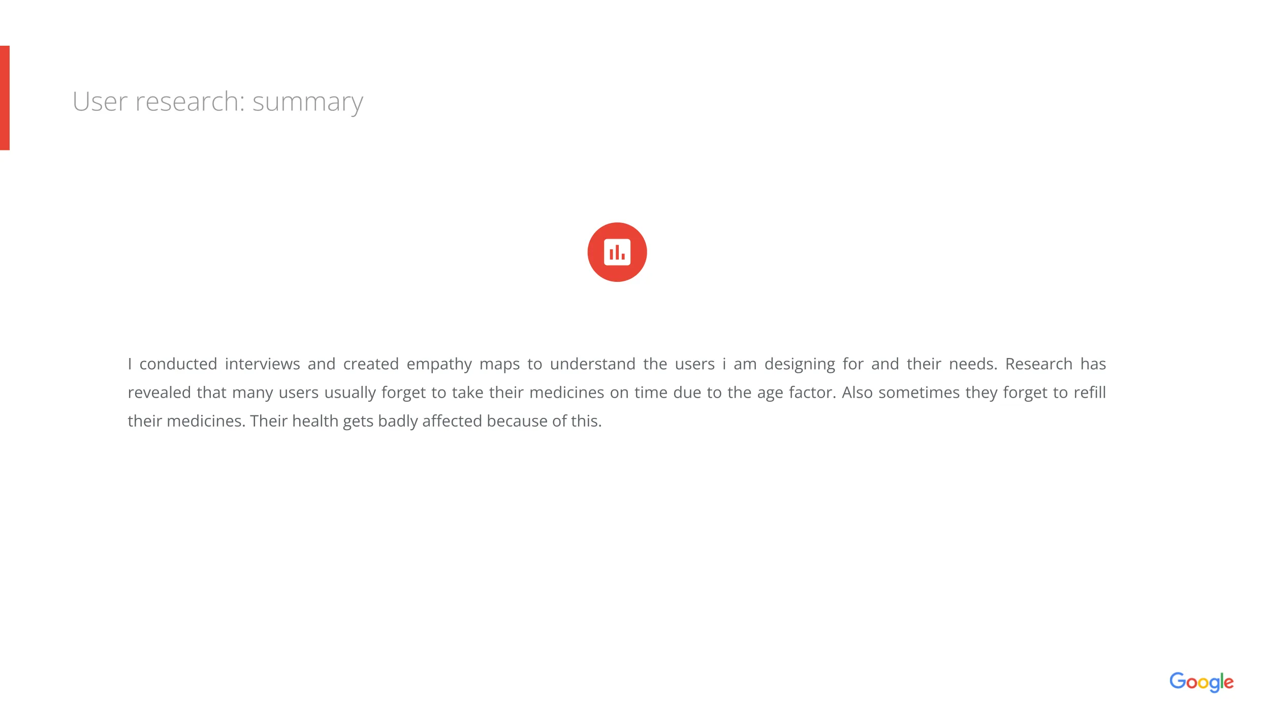
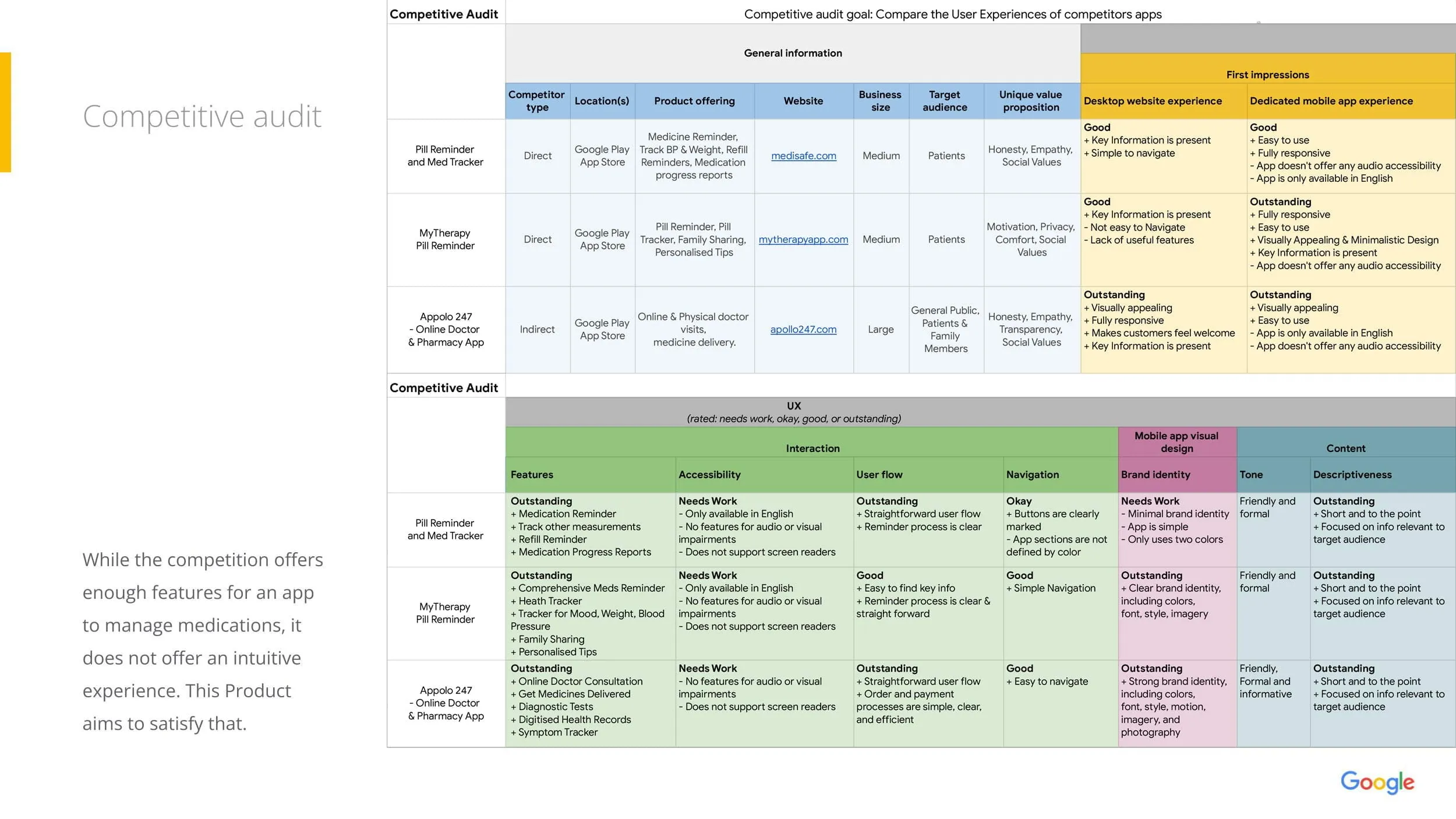
Research explored how users currently manage medications and identified the most common challenges they experience throughout their daily routines.
Interviews and competitive analysis revealed several recurring patterns.
Key Insights
These findings shaped the application's overall information architecture and interaction design.
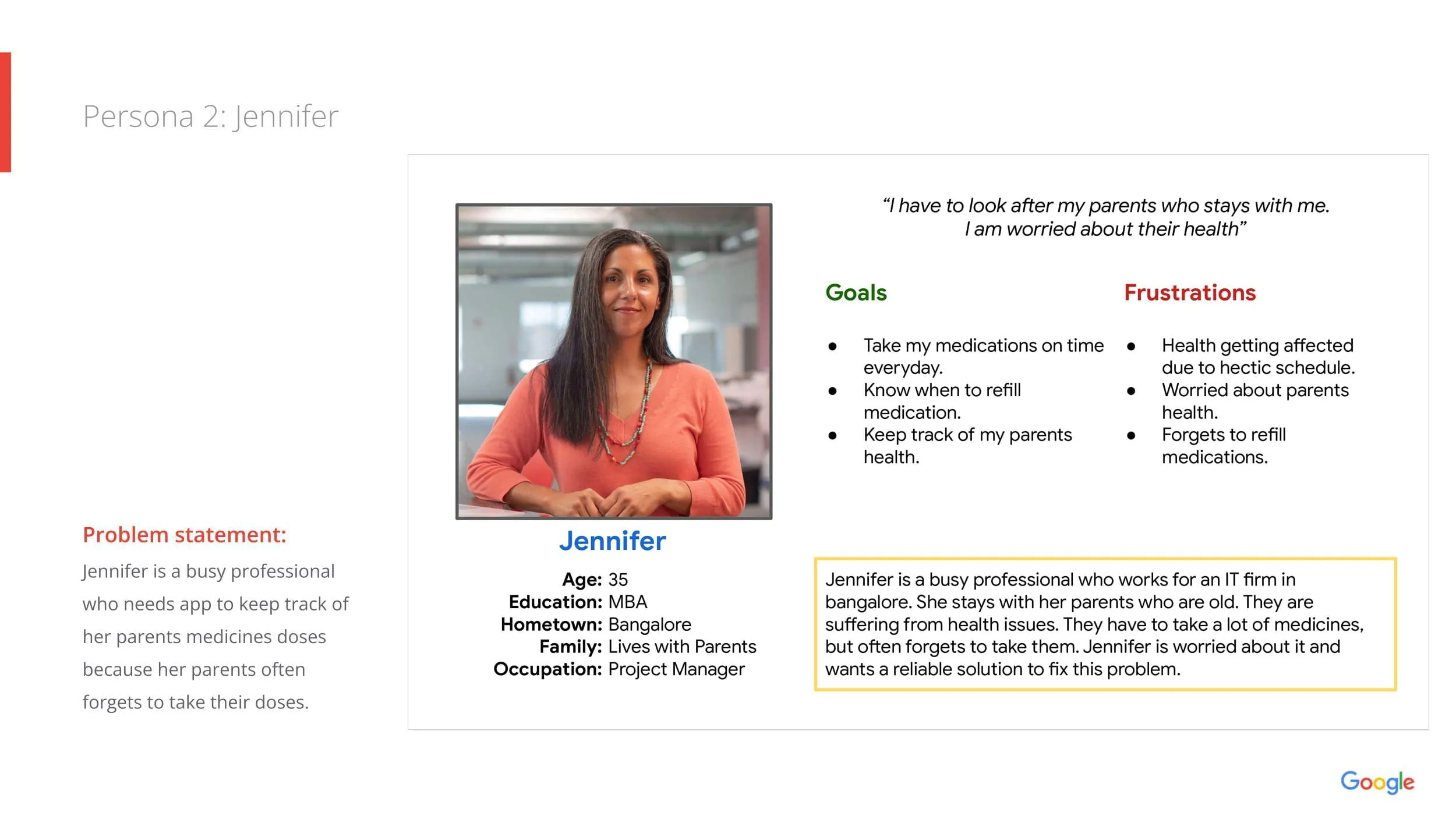
User Persona
Representing the primary user group targeted during the MedTrack design process.
Maria
Goals
- Never miss medications.
- Keep prescriptions organized.
- Track medication history.
- Feel confident managing daily treatment.
Pain Points
- Forgetting doses.
- Confusing medication schedules.
- Difficulty remembering completed medications.
- Managing multiple prescriptions.
User Journey
The user journey identified opportunities to reduce friction and streamline interactions throughout everyday medication management.
The journey highlighted opportunities to simplify decision-making while reducing cognitive effort.
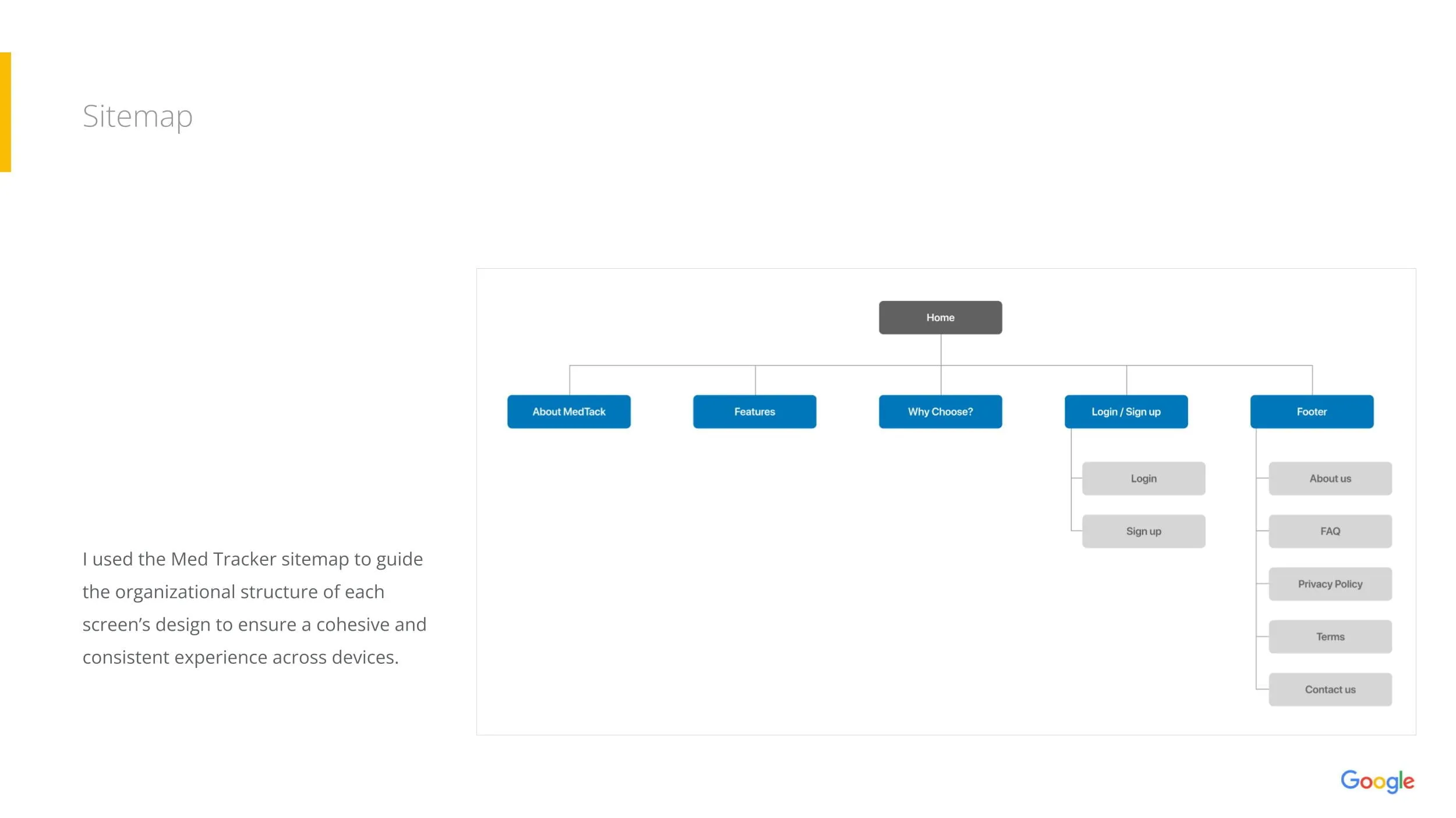
Information Architecture
The application follows a straightforward healthcare workflow designed to minimize mental effort during daily use.
Organizing content around daily tasks reduced navigation complexity and improved discoverability.
Wireframing
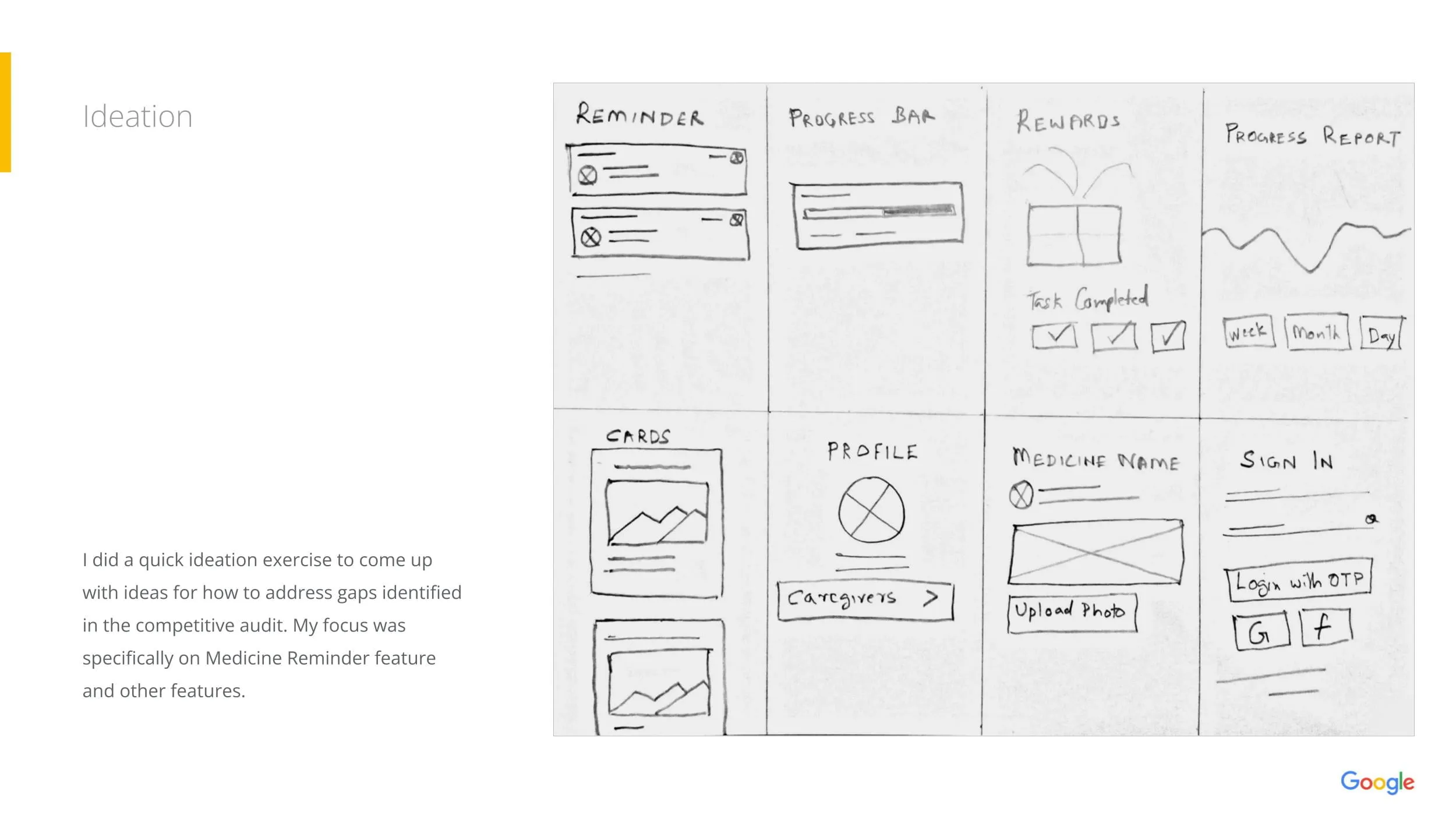
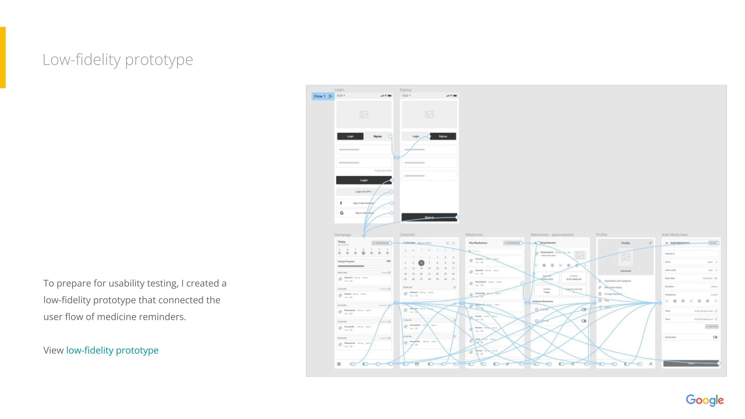
The design process began with low-fidelity paper sketches exploring different layouts for medication reminders, prescription lists, and progress tracking.
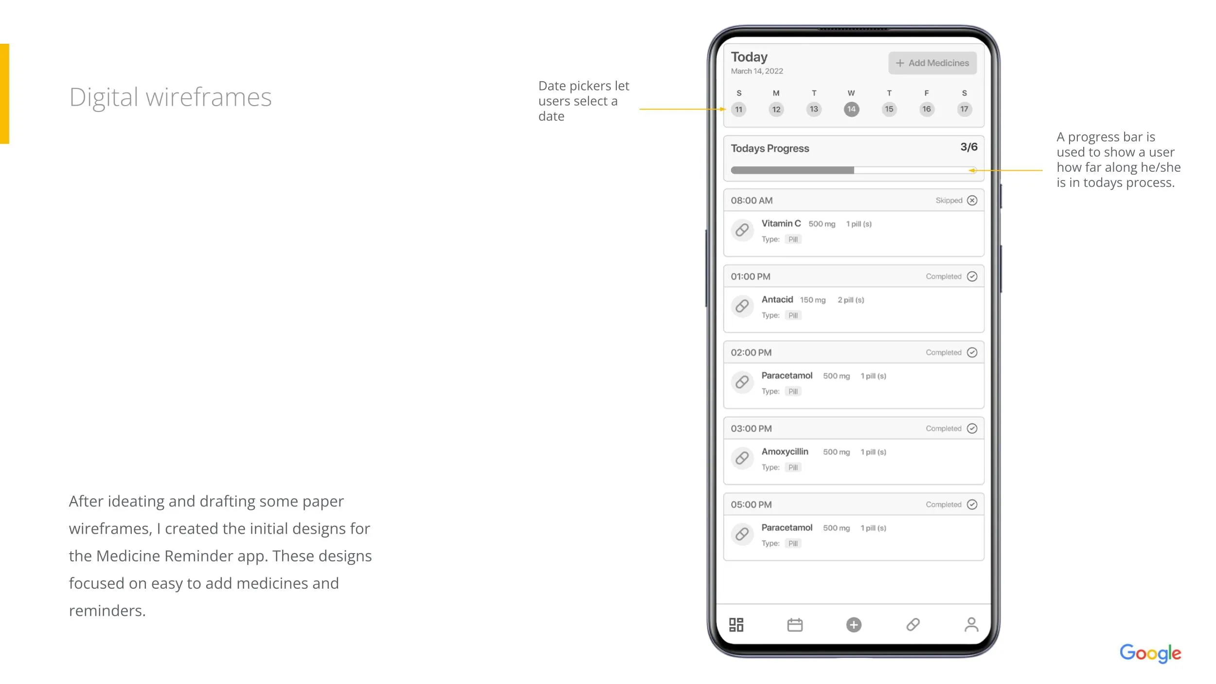
These concepts evolved into digital wireframes before being refined into high-fidelity prototypes through multiple design iterations.
Key UX Decisions
Strategic design choices implemented to ensure clarity, compliance, and ease of use.
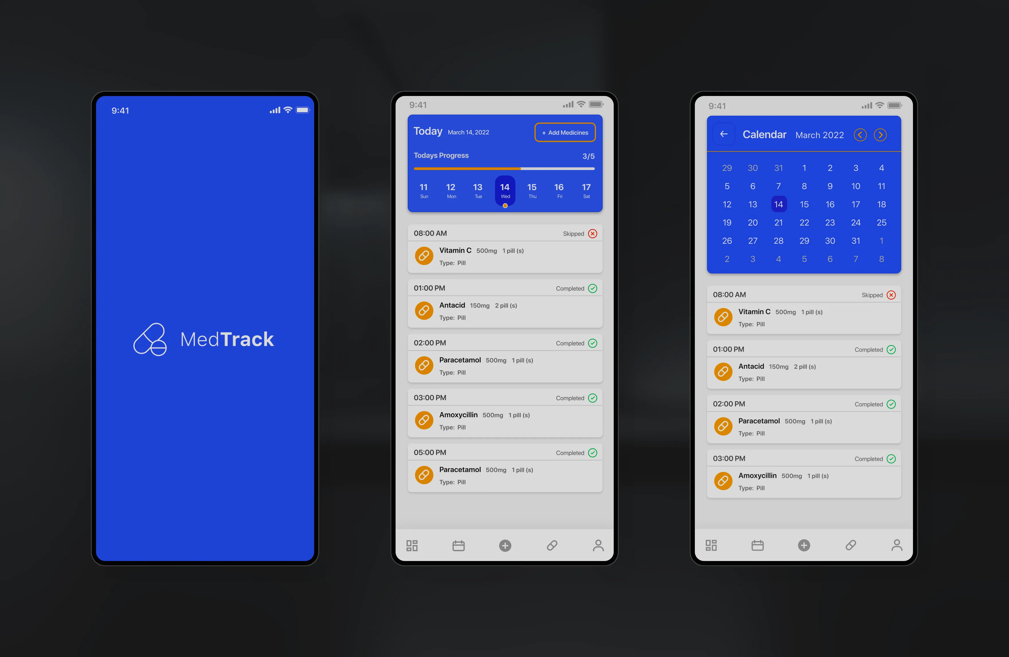
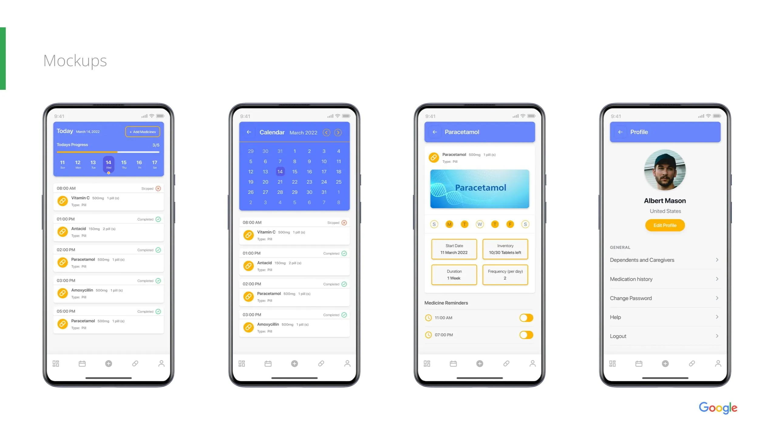
Designed a focused home screen that immediately communicates what medications need attention today.
Created simple reminder notifications with straightforward actions to reduce missed doses.
Provided an easy-to-read history so users could confirm completed medications and identify missed doses.
Visual progress indicators encourage medication adherence while minimizing unnecessary complexity.
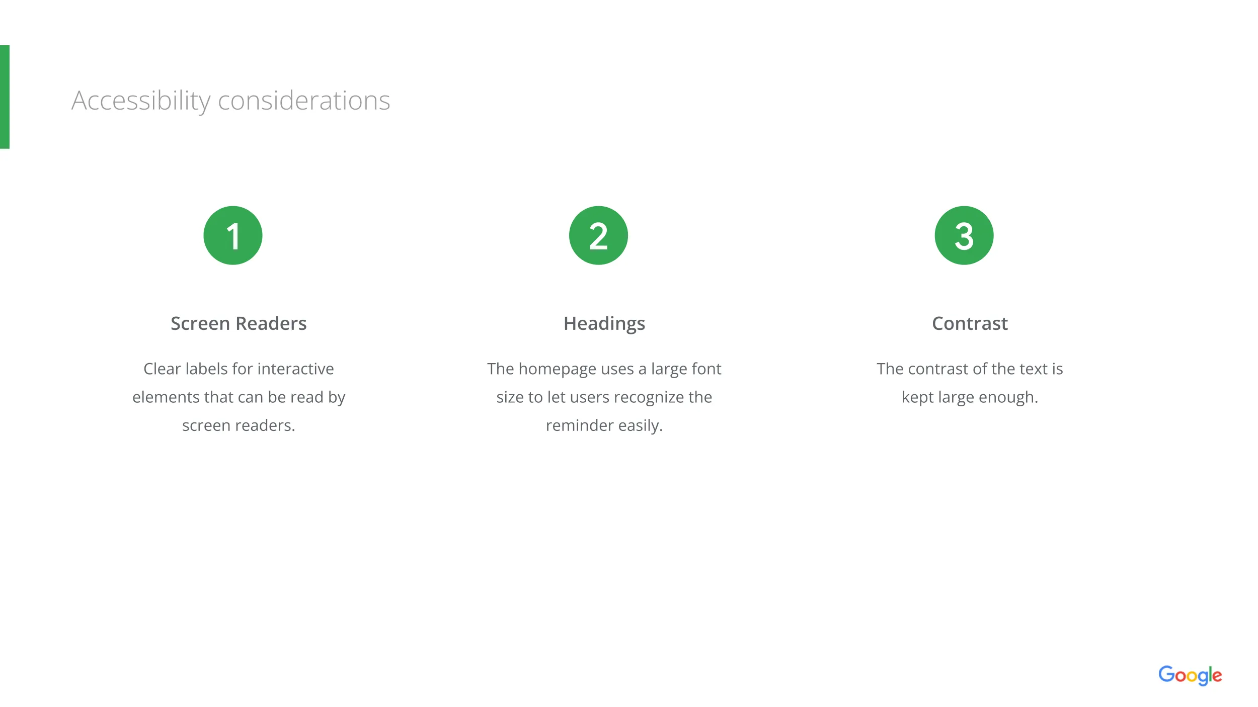
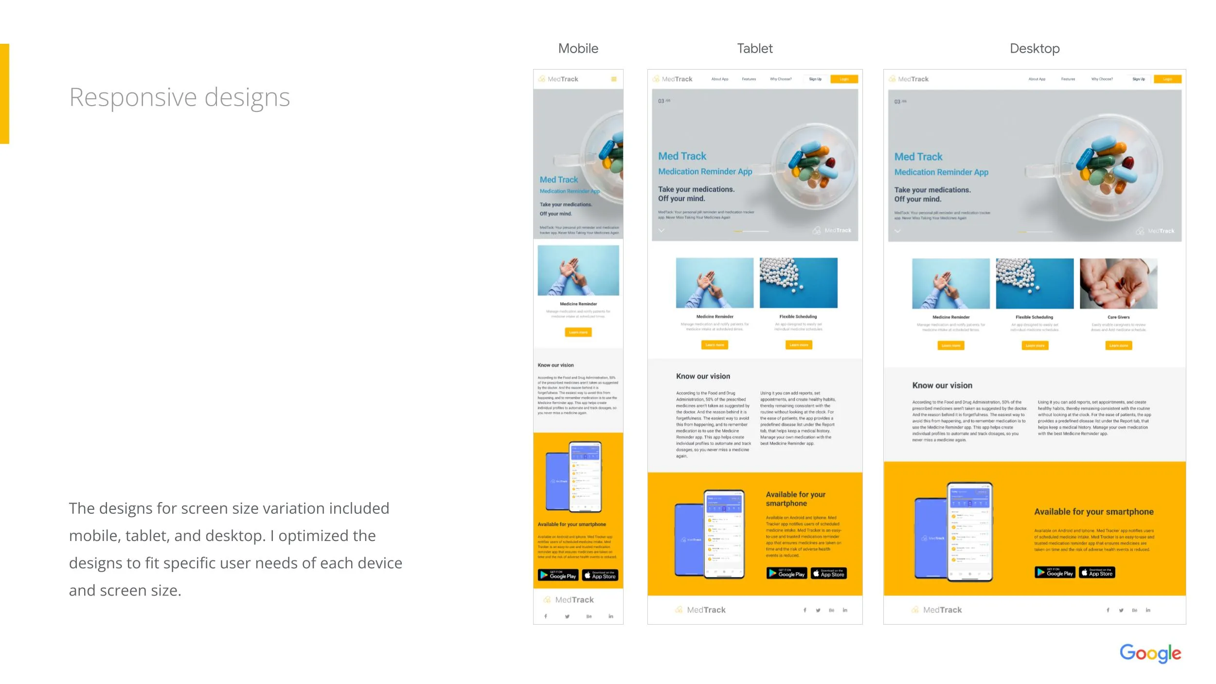
Designed large touch targets, readable typography, and simple navigation suitable for a wide range of users.
Visual Design
The interface emphasizes calm, clarity, and trust to support an approachable healthcare environment.
Large readable typography supports quick recognition and effortless scanning.
Soft healthcare-inspired colours create a reassuring experience while maintaining high accessibility standards.
Accessibility improvements include:
Interactive Prototype
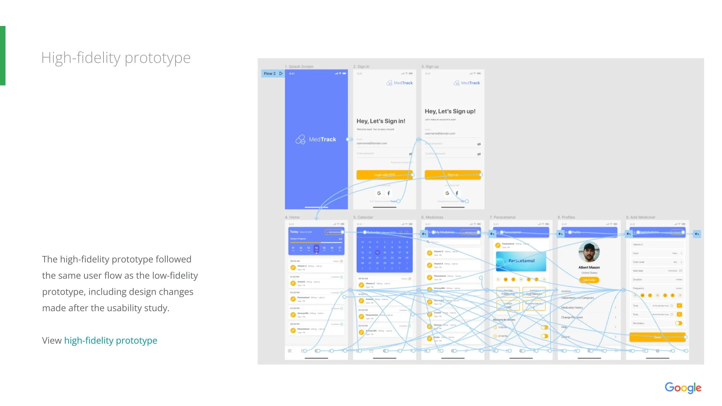
Interactive prototypes simulated the complete medication management experience, allowing users to navigate reminders, confirm medications, review history, and provide usability feedback before finalizing the design.
Usability Testing
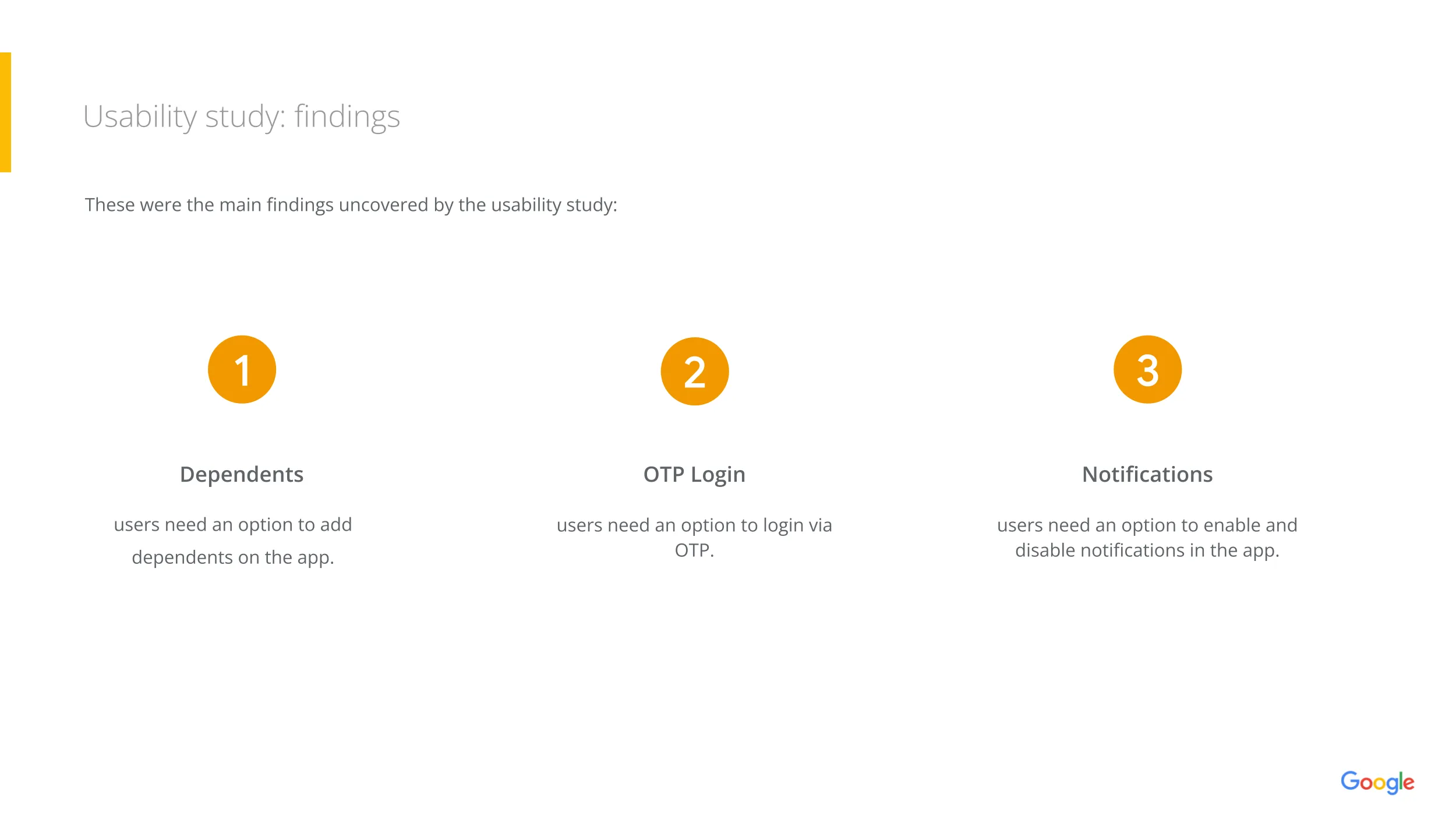
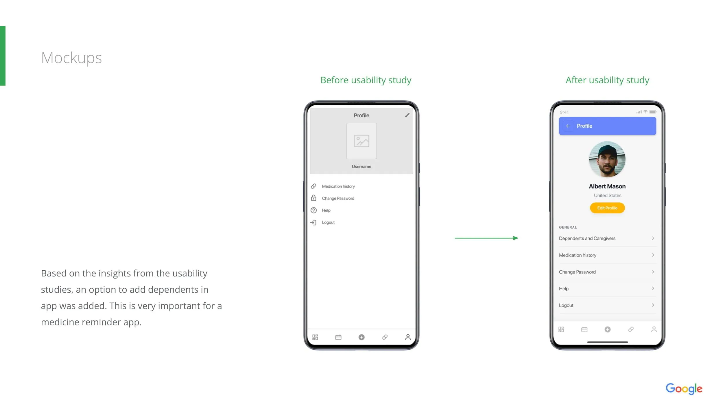
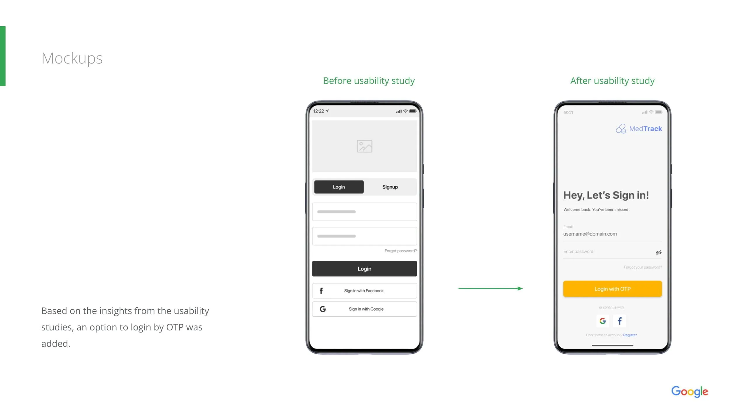
Usability testing identified several opportunities for refinement, mapping direct user observations to targeted design improvements.
| Observation | Improvement |
|---|---|
| Users overlooked reminder actions | Increased visual prominence |
| Medication history was difficult to scan | Improved grouping and hierarchy |
| Navigation labels created confusion | Simplified terminology |
| Confirmation flow felt unclear | Added immediate visual feedback |
Each round of testing informed iterative improvements that strengthened usability and user confidence.
Final Solution
MedTrack delivers a user-centered medication management experience focused on improving adherence while minimizing daily complexity.
Key Learning Outcomes
This project reinforced several important UX principles that continue to guide effective product development.
Reflection
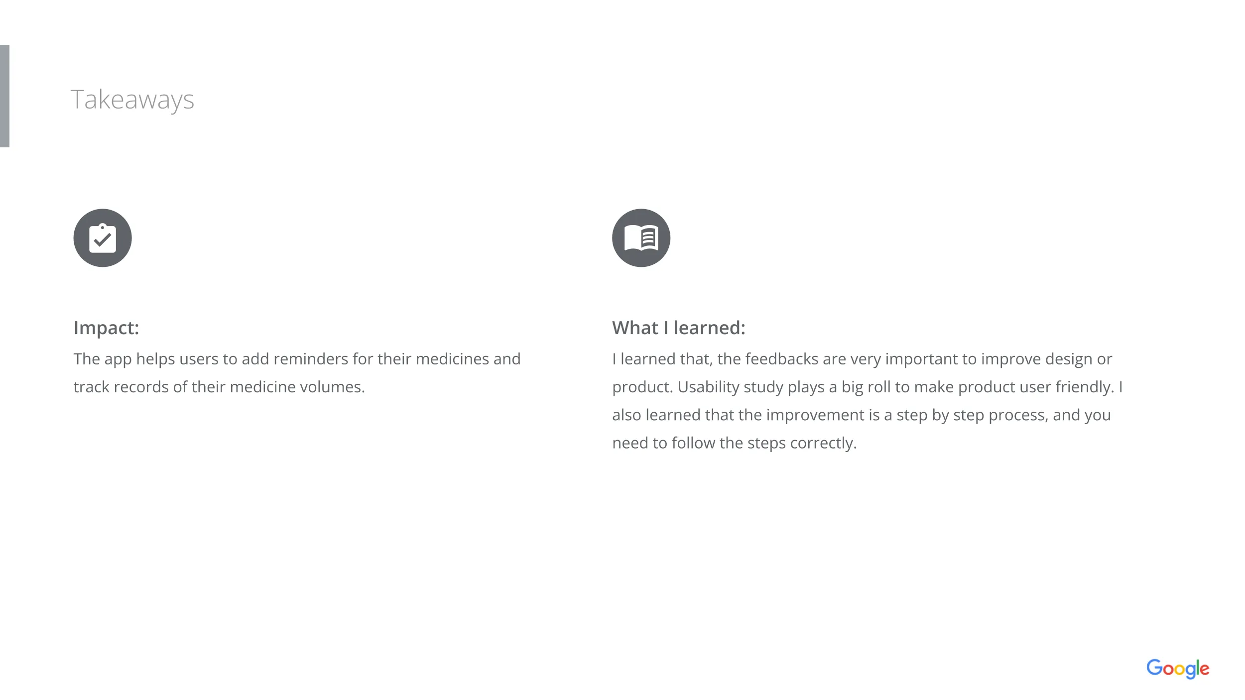
Developing MedTrack as part of the Google UX Design Professional Certificate reinforced the importance of designing healthcare experiences that support users during routine but important tasks.
Unlike clinical enterprise software used by healthcare professionals, MedTrack focused on empowering patients through clear information, timely reminders, and intuitive interactions. The project strengthened my ability to translate research into practical, human-centered solutions while balancing usability, accessibility, and trust.
"Healthcare experiences are most effective when they reduce uncertainty and help people feel confident in managing their own care."
— Design PrincipleSkills Demonstrated
Core competencies applied throughout the end-to-end MedTrack design and research lifecycle.