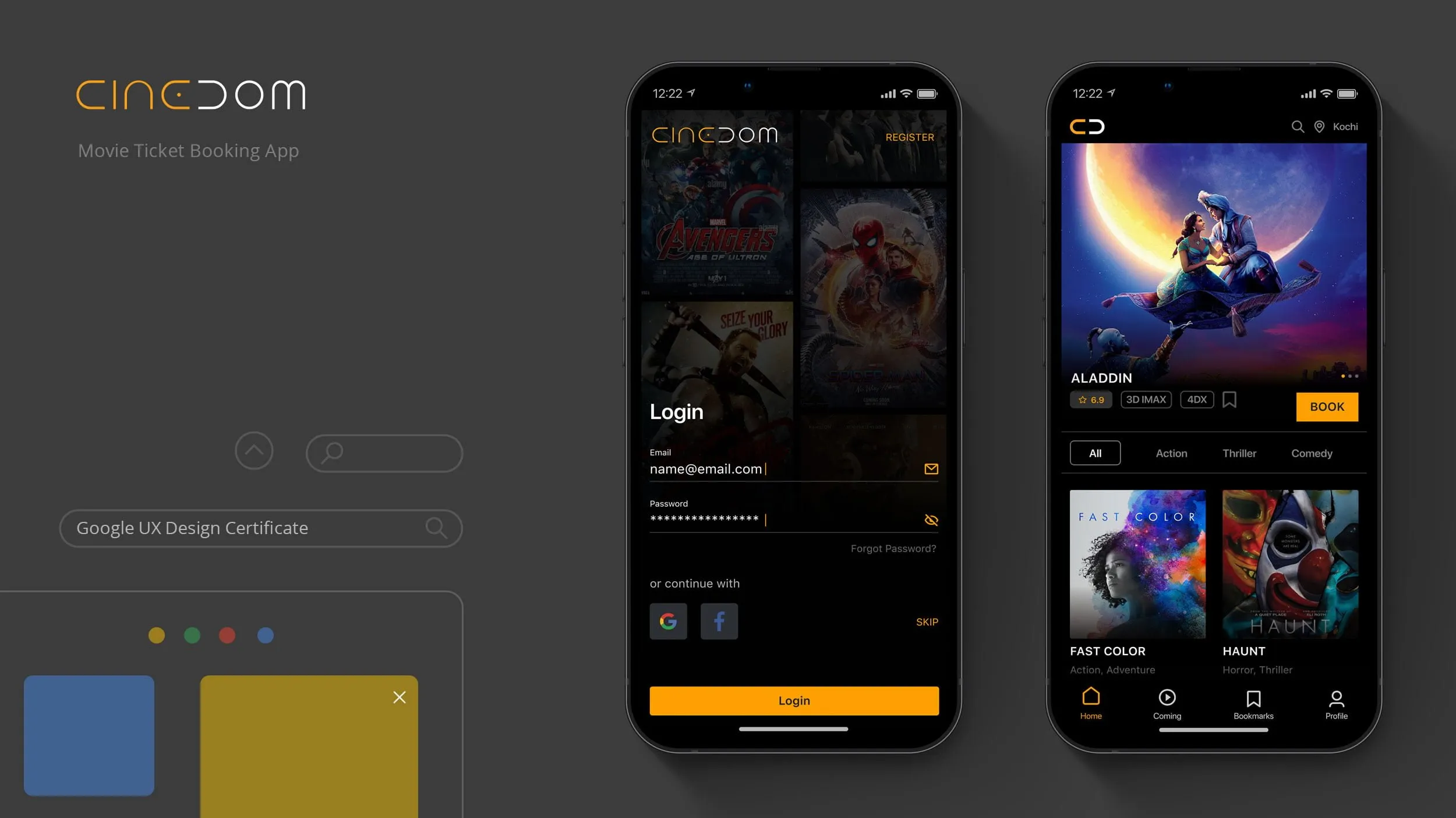
CINEDOME
category:
UX Design
services:
Design
My Role:
UX Designer
(End-to-End design from research to high-fidelity prototyping)
Tools Used:
Figma, Google Slides, Google Sheets (for research), Paper & Pencil
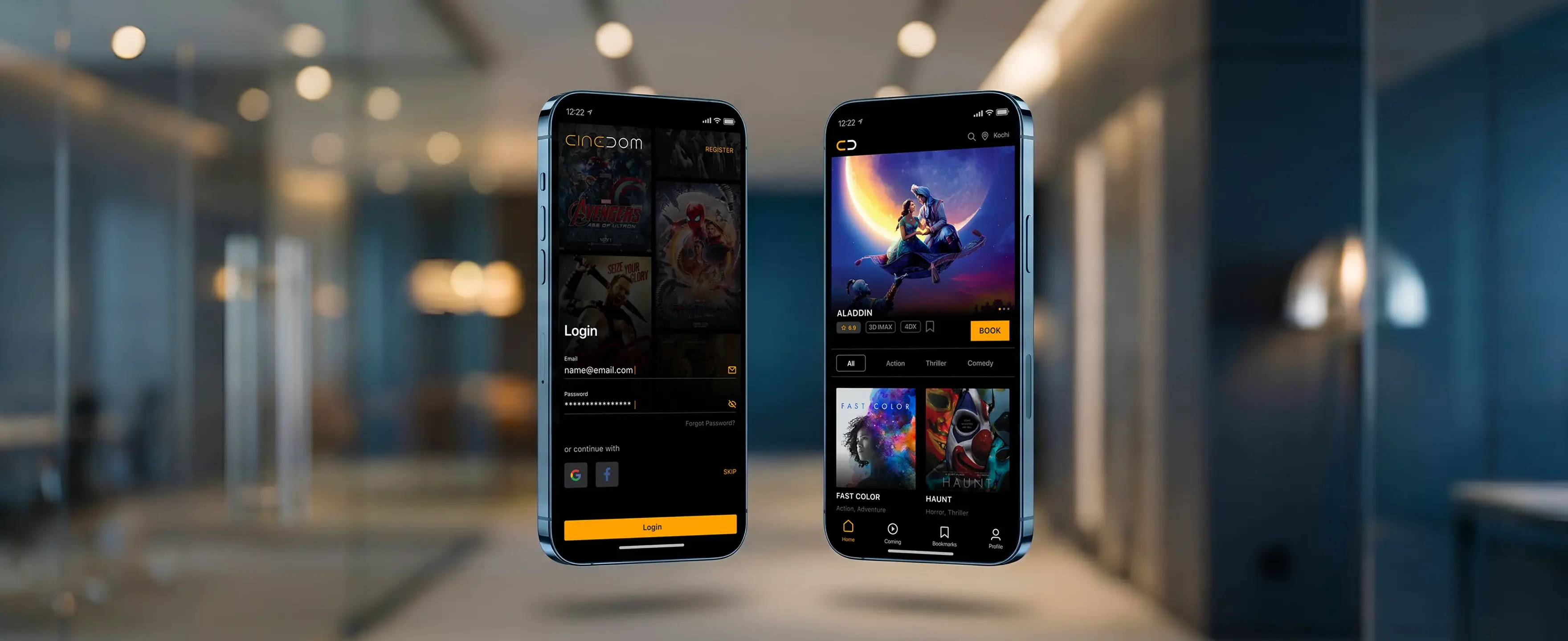
Movie Ticket Booking App
A UX Case Study by Sarin VK
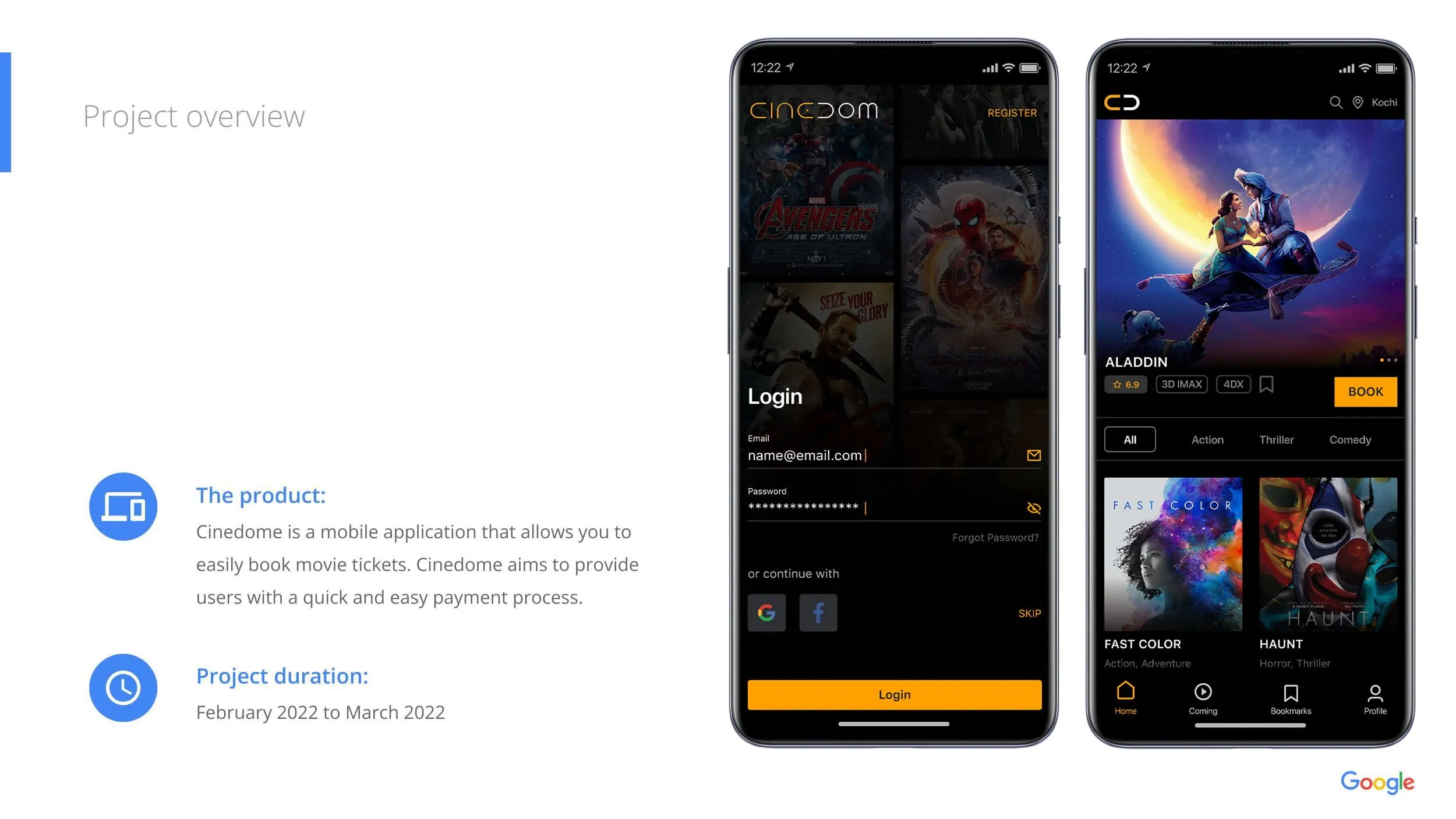
The Product Cinedome is a mobile application designed to streamline the movie ticket booking experience. It aims to provide users with a quick, intuitive interface for browsing movies and a hassle-free payment process.
The Problem Busy working professionals and students often lack the time to visit theaters in advance to book tickets. They face long queues and uncertainty about seat availability when booking last minute.
The Goal Design a dedicated mobile app that allows users to book movie tickets easily, view showtimes, and complete payments quickly without the stress of physical queues.
Understanding the User
I conducted foundational user research to identify the primary target audience and understand their specific hurdles when going to the cinema.
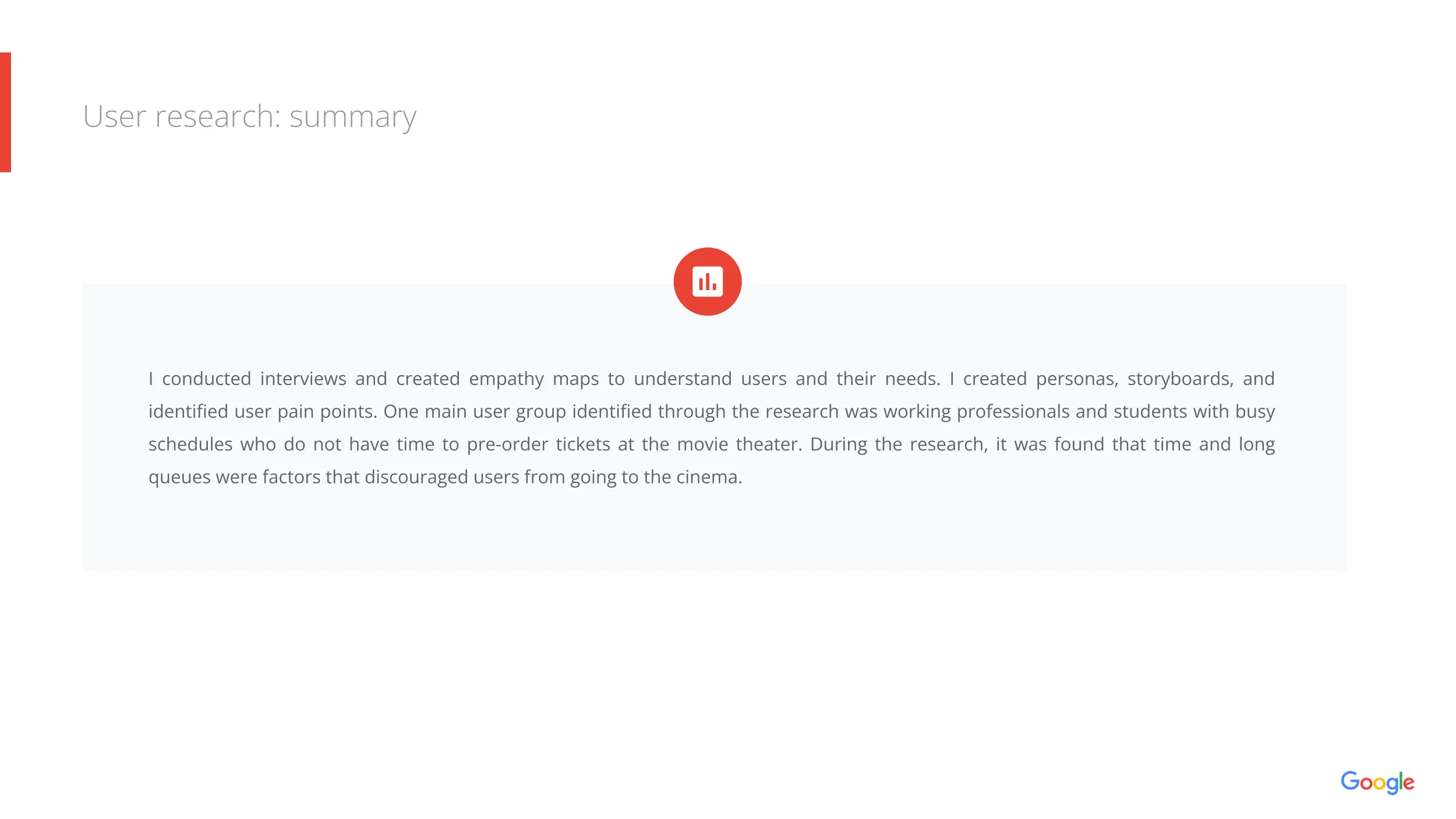
User Research Summary
The primary user group consists of working professionals and students with busy schedules. The research revealed that time constraints and the frustration of standing in long queues were the main factors discouraging users from going to the cinema.
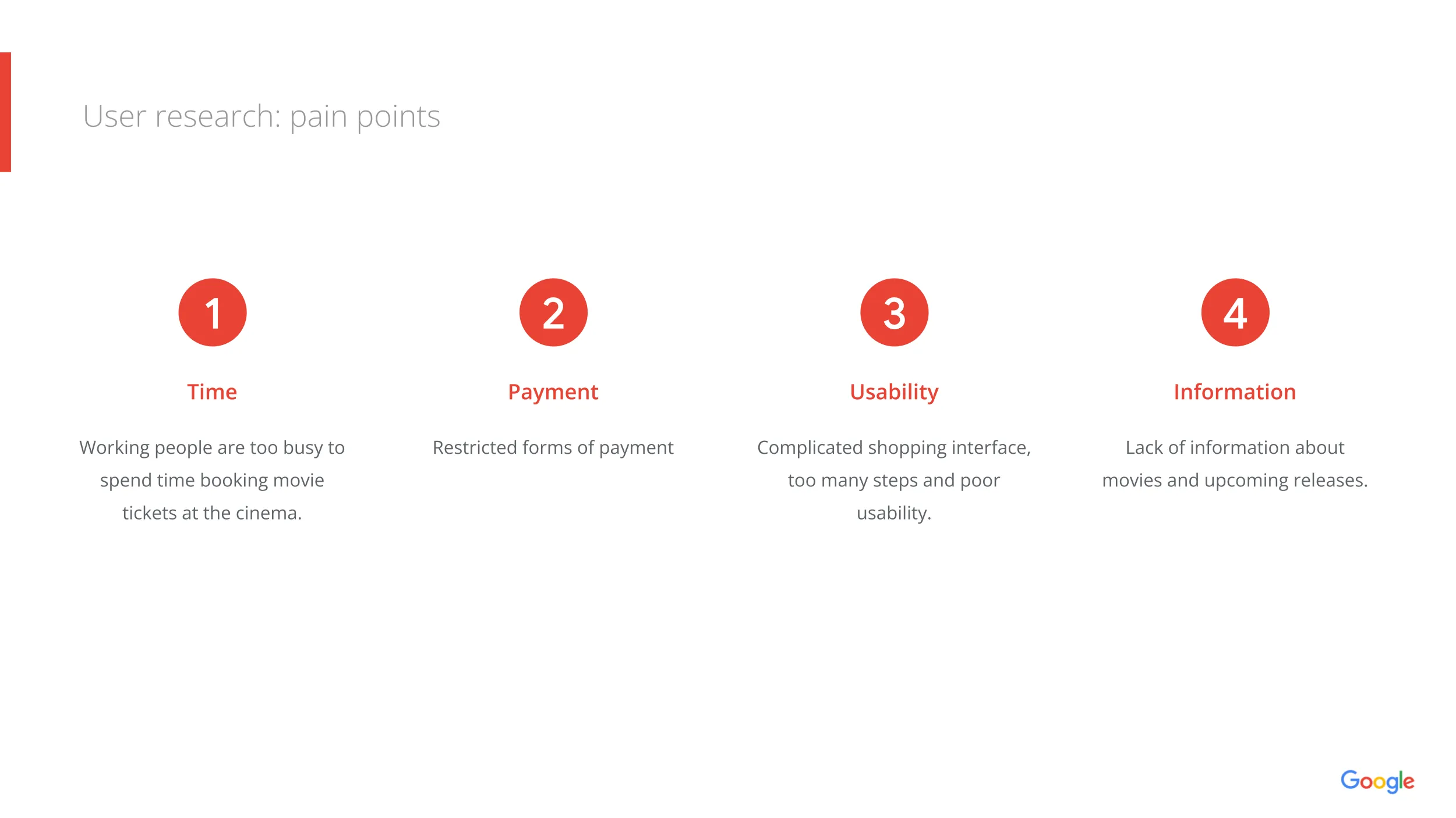
Key Pain Points
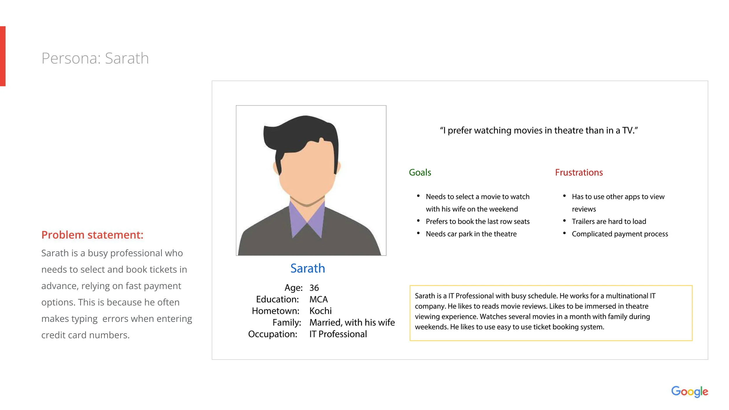
Persona: Sarath
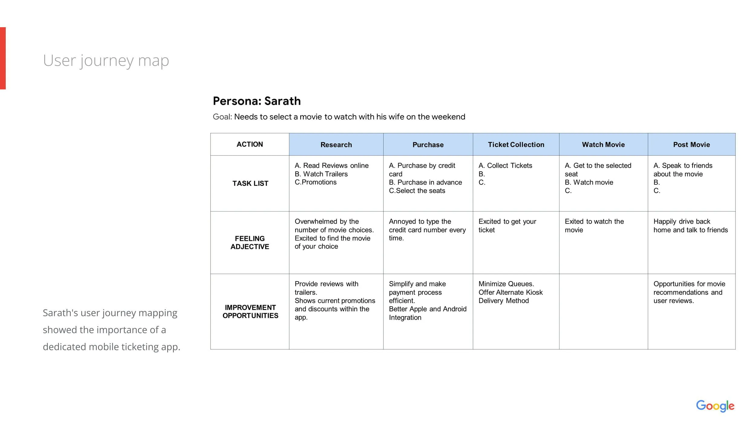
User Journey Map
- Time: Users are too busy to spend time traveling to the cinema just to book tickets in advance.
- Payment: Existing solutions often have restricted forms of payment or complicated checkout flows.
- Usability: Competitor platforms often feature complicated shopping interfaces with too many steps.
- Information: Users felt there was a lack of centralized information regarding movie details, reviews, and upcoming releases.
- Profile: 36-year-old IT Professional from Kochi. Married.
- Goal: Wants to watch movies on weekends with his wife but needs specific "last row" seats.
- Frustrations: Hates typing credit card numbers repeatedly; finds trailers hard to load on other apps; dislikes the uncertainty of parking availability.
- Quote: "I prefer watching movies in a theatre than on a TV."
Mapping Sarath's journey highlighted opportunities to improve the Research and Purchase phases.
- Current Friction: Feeling overwhelmed by choices $\rightarrow$ Annoyed by data entry $\rightarrow$ Waiting in queues to collect tickets.
- Design Opportunities: Provide reviews/trailers in-app, simplify payments, and offer QR code entry.
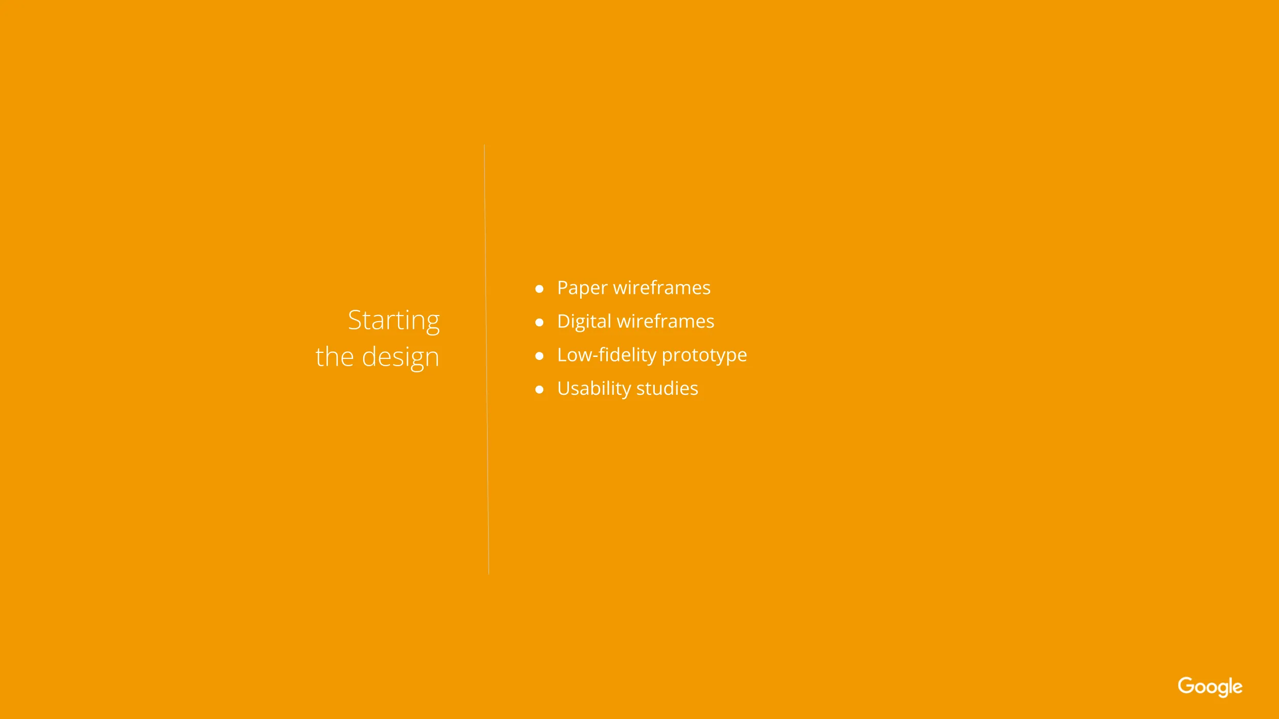
Starting the Design
Paper to Digital Wireframes
Low-Fidelity Prototype
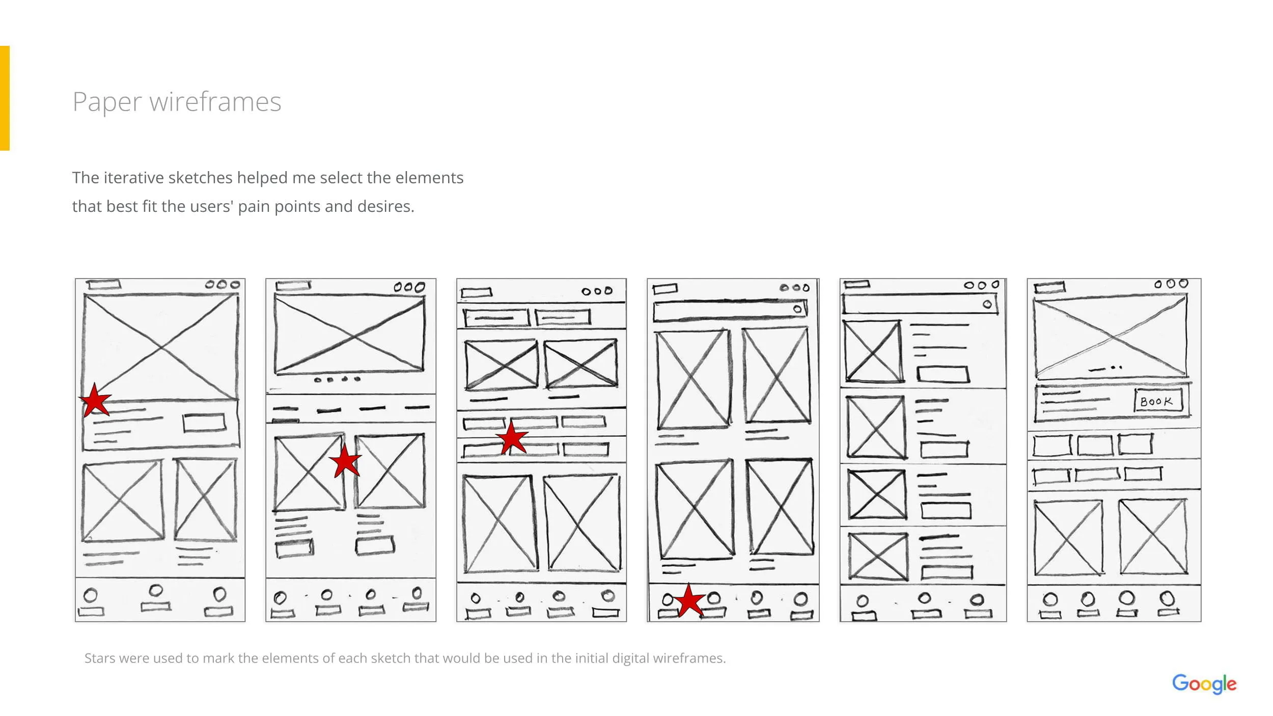
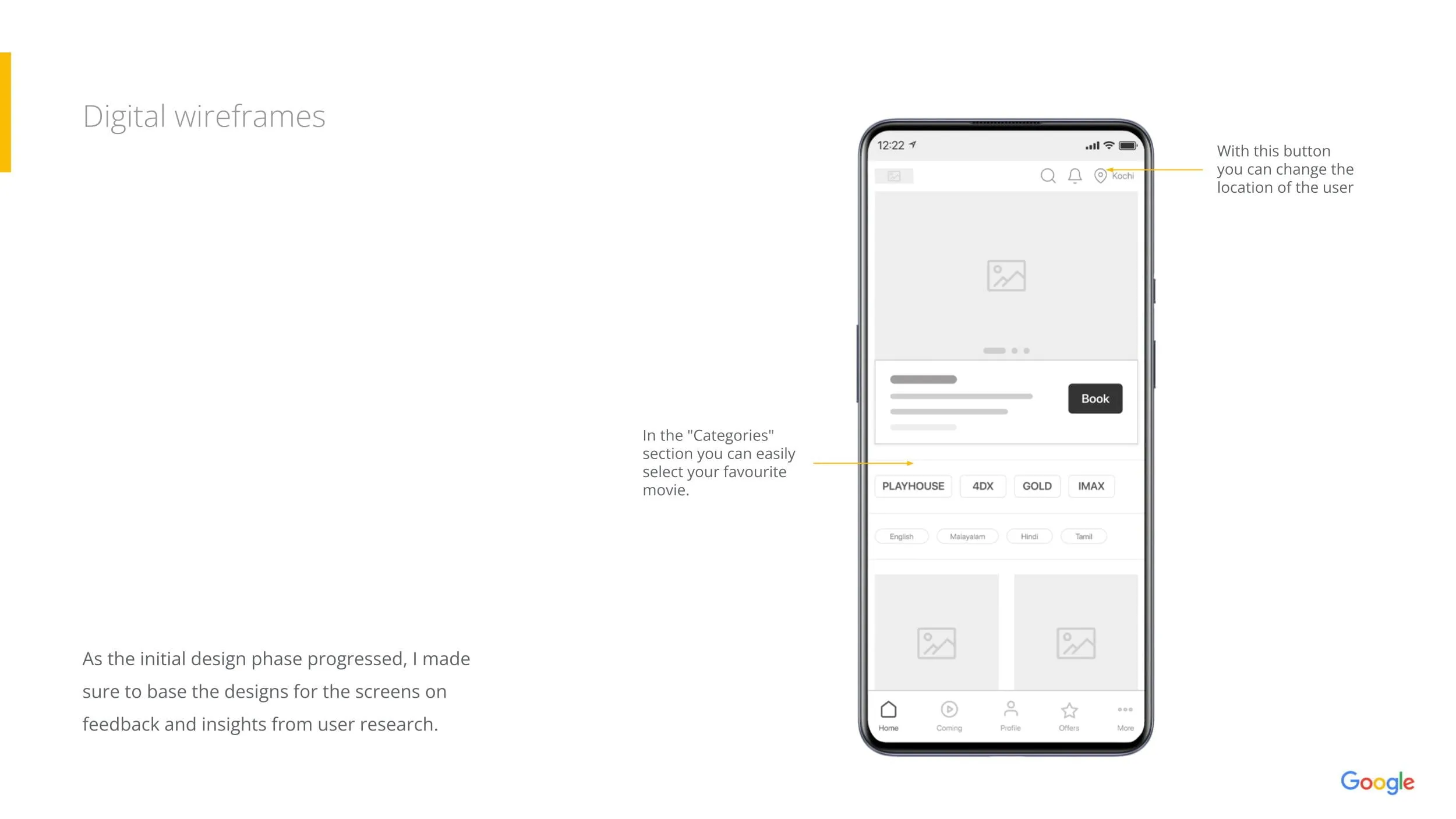
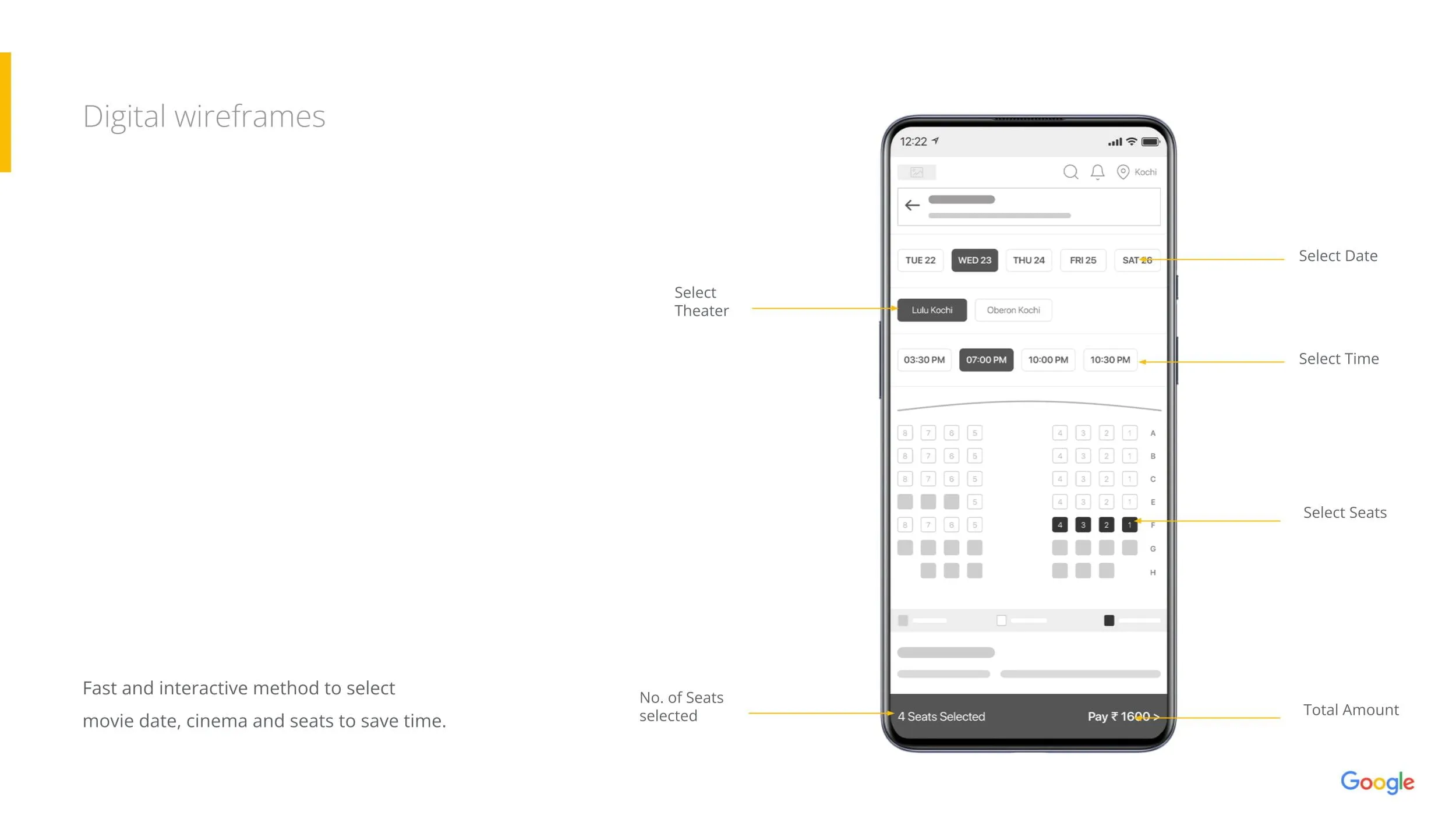
I started with paper sketches, using the "starring" method to identify the best layout elements. These were translated into digital wireframes with a focus on:
- Fast Booking: A consolidated interface allowing users to select Date, Theater, Time, and Seats in one flow.
- Location Flexibility: A toggle to easily switch cities (e.g., Kochi).
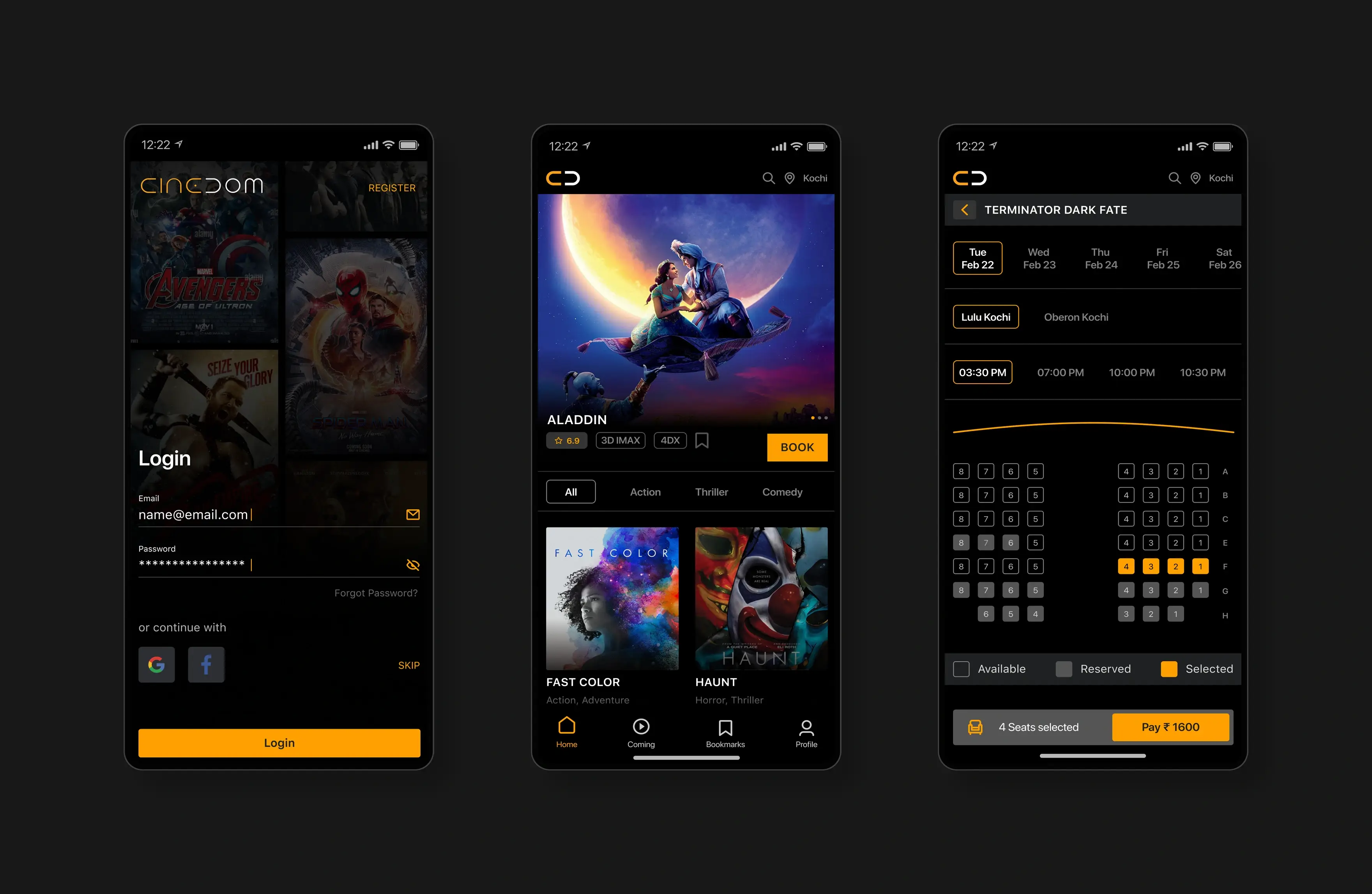
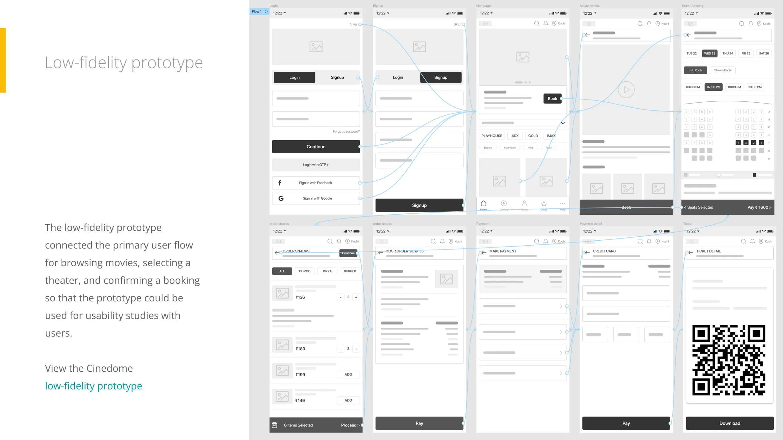
I connected the wireframes to create a clickable low-fidelity prototype in Figma. This prototype covered the primary flow—Login $\rightarrow$ Browse $\rightarrow$ Select Seats $\rightarrow$ Pay—and was used for the initial round of usability testing.
Usability Studies & Iteration
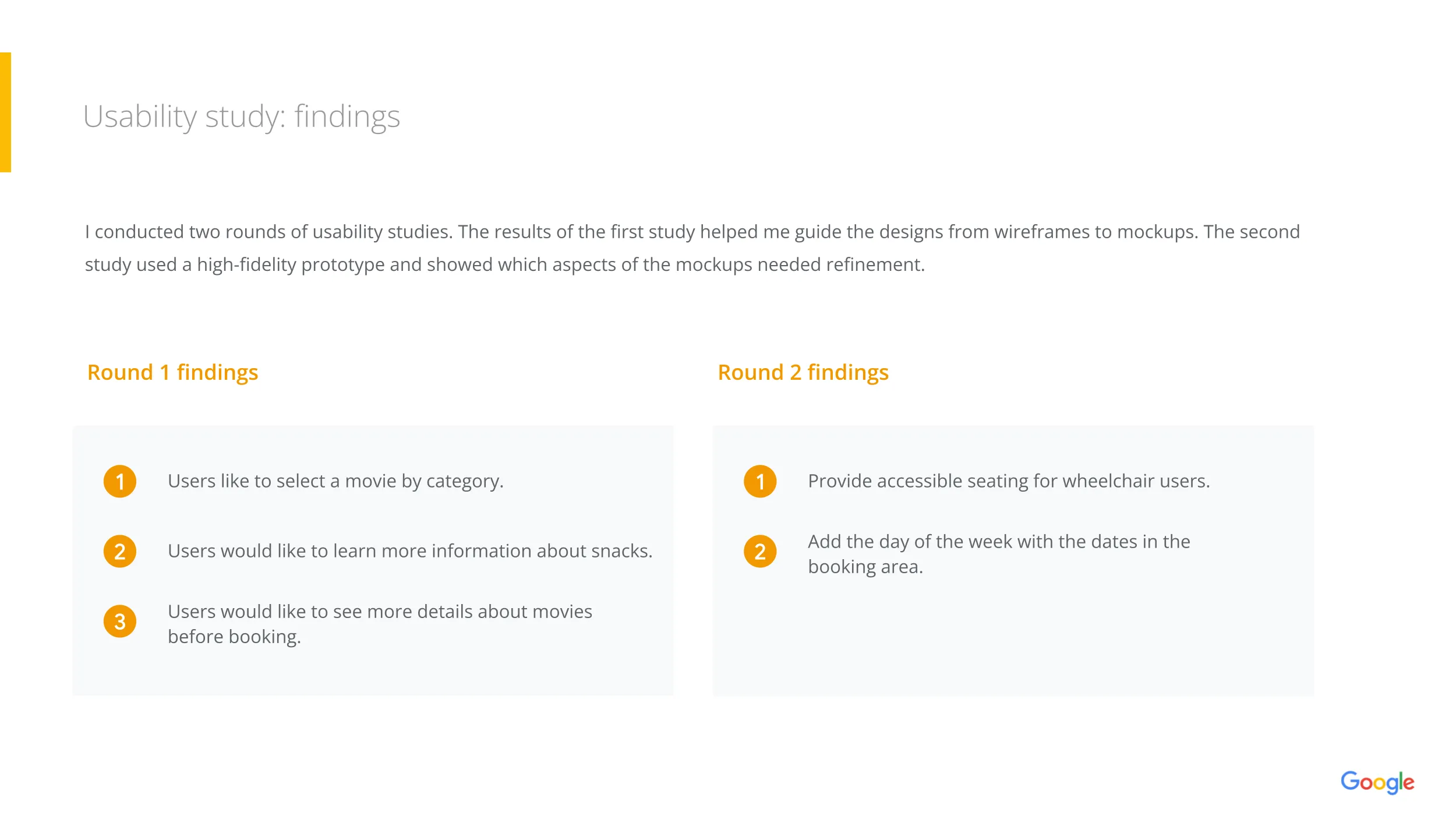
I conducted two rounds of usability studies to validate the design.
Round 1 Findings (Low-Fidelity)
Round 2 Findings (High-Fidelity)
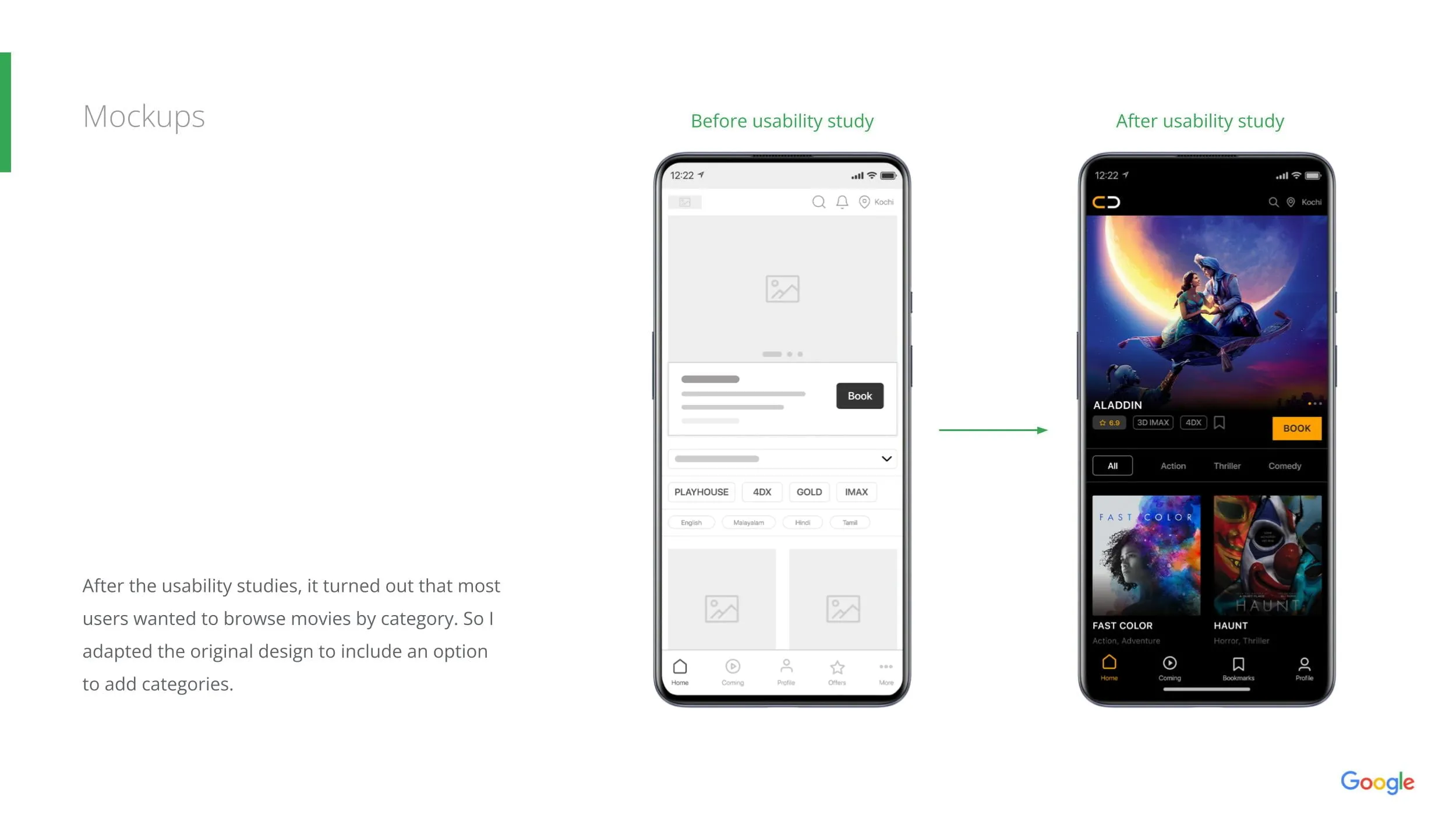
- Insight: Users struggled to find specific genres.
- Fix: Added a "Categories" filter (Playhouse, 4DX, IMAX) to the home screen.
- Insight: Users wanted more details before booking.
- Fix: Expanded the movie details page to include Cast, Synopsis, and Trailer.
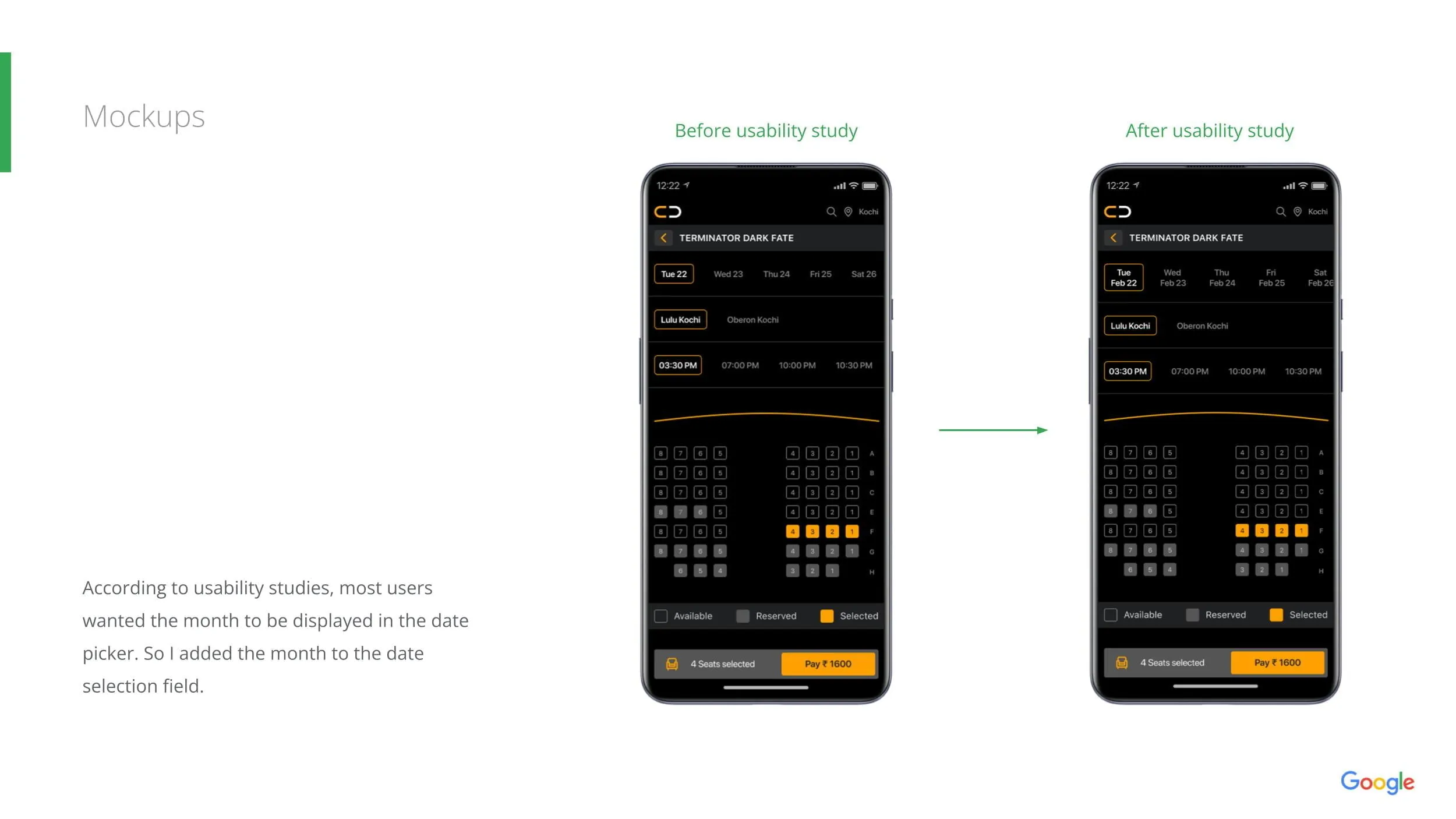
- Insight: The date picker was confusing using only numbers.
- Fix: Updated the date selector to show Day + Date (e.g., "Tue Feb 22") to prevent booking errors.
- Insight: Accessibility was lacking for seating.
- Fix: Clearly marked wheelchair-accessible seating in the visual layout.
Final Design
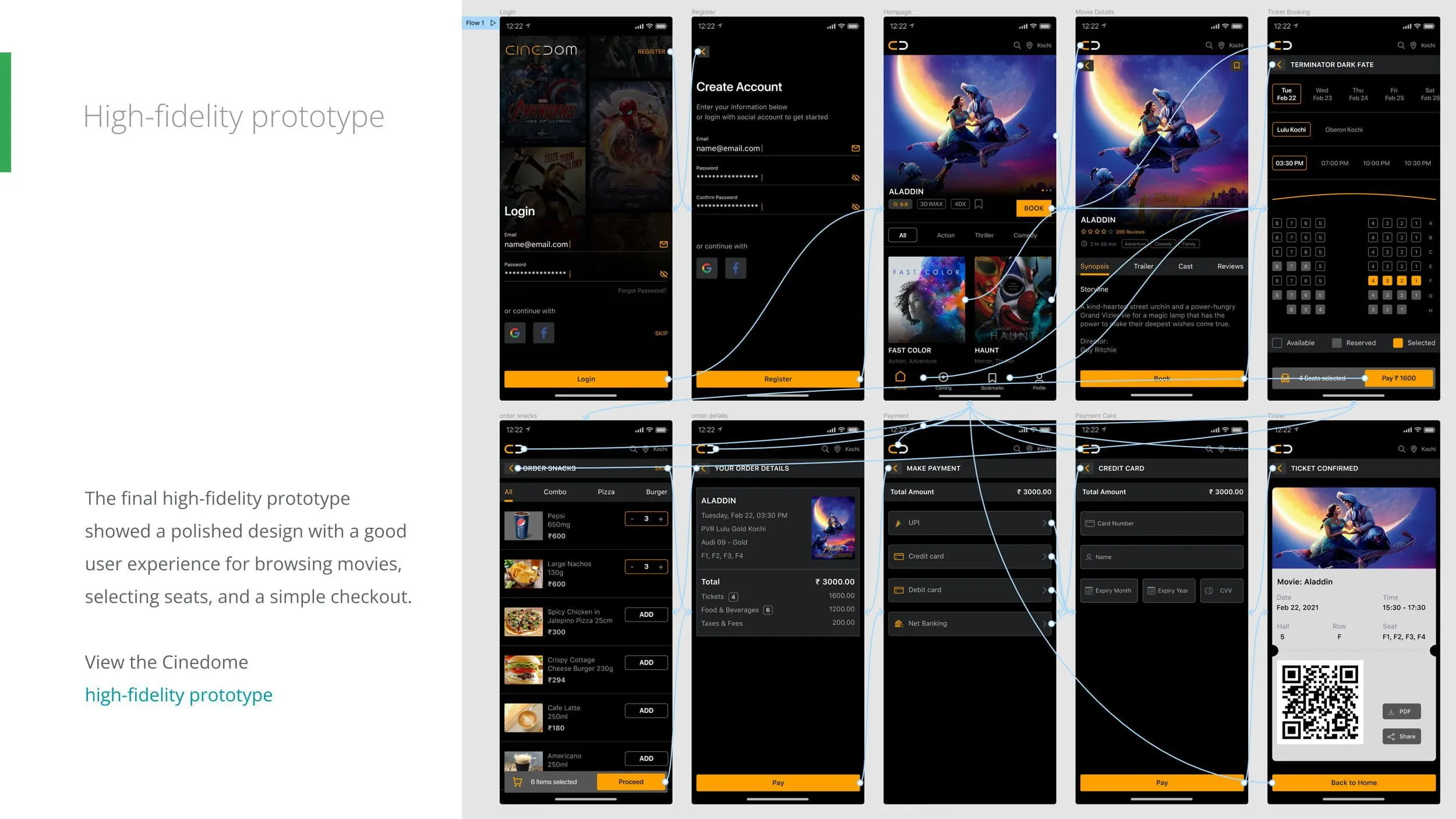
High-Fidelity Prototype
Accessibility Considerations
The final design features a "Dark Mode" aesthetic that mimics the cinematic environment. It connects the browsing experience directly to a streamlined checkout.
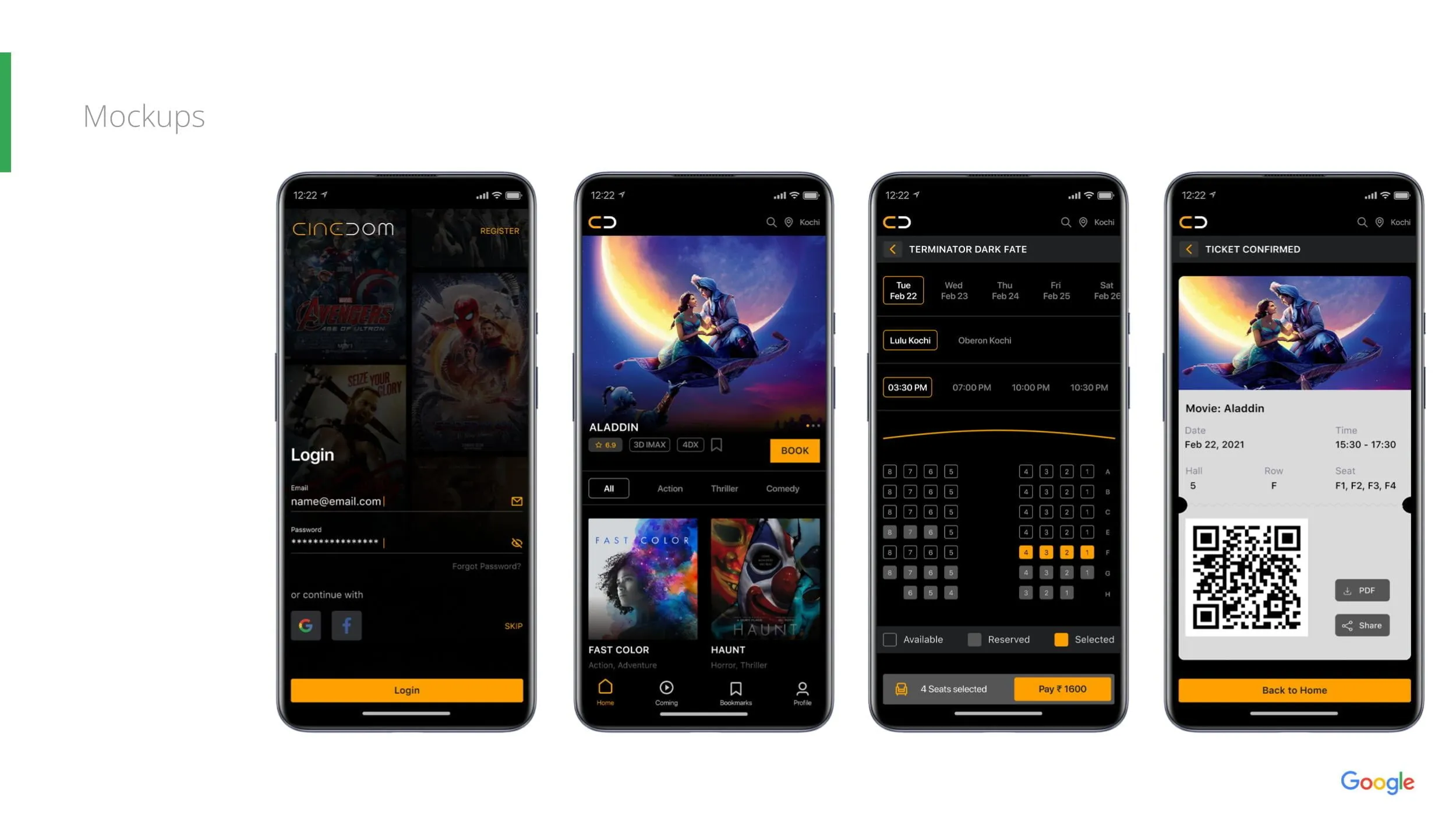
- Immersive Home: Large poster art and clear category pills.
- Smart Seat Selection: A clear visual map distinguishing Available, Reserved, and Selected seats.
- Integrated Snacks: Users can add popcorn/drinks directly within the checkout flow.
- Digital Ticket: A final QR code screen allows for paperless entry at the theater.
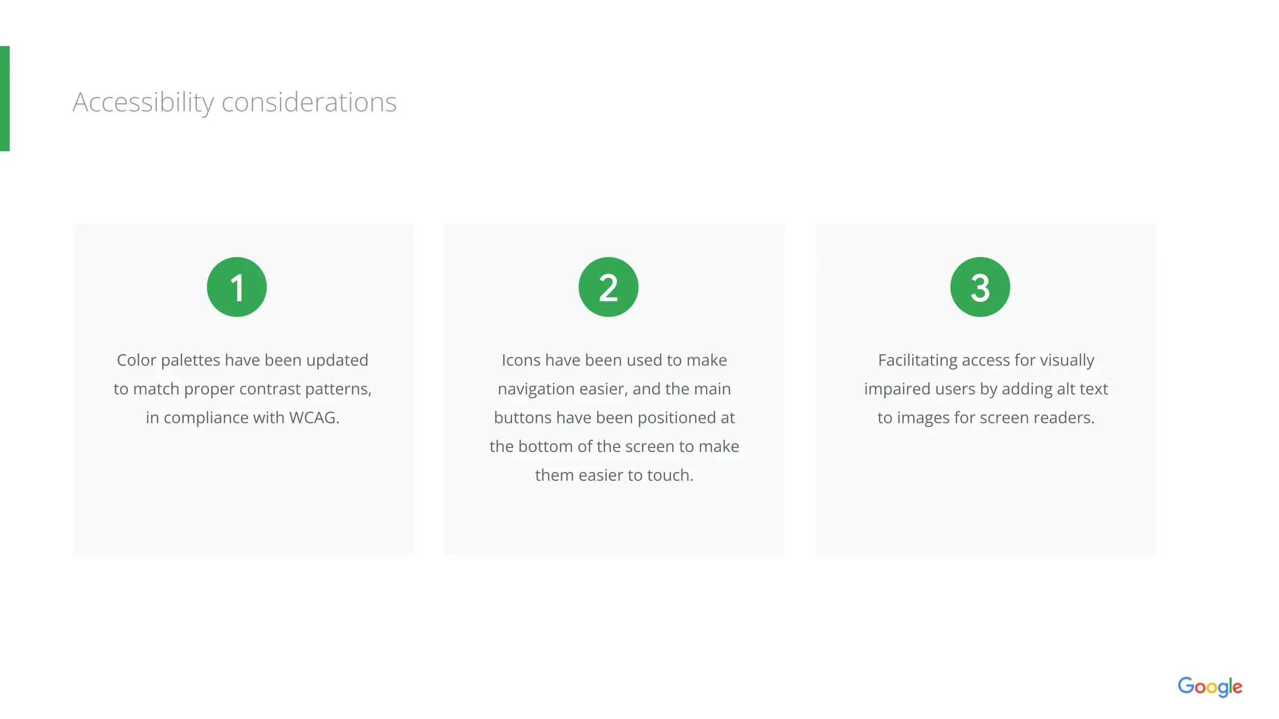
- Color Contrast: Palette adjusted to meet WCAG contrast standards for readability.
- Touch Targets: Main navigation and "Call to Action" buttons (like Pay ₹1600) are positioned at the bottom of the screen for easy thumb reach.
- Screen Readers: Images and icons include alt-text to support visually impaired users.
Takeaways & Next Steps
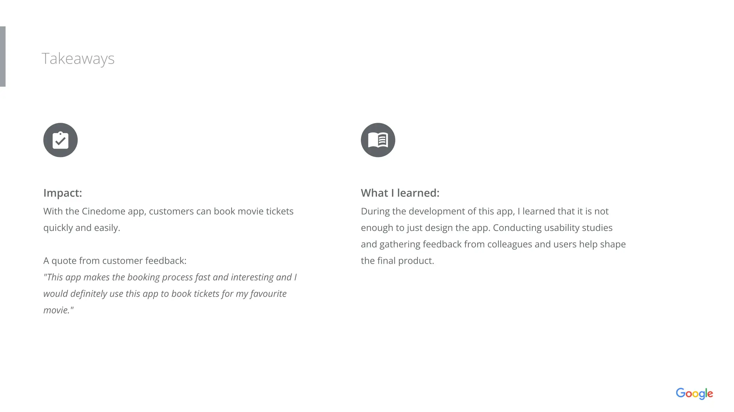
Impact
What I Learned
Next Steps
The final prototype demonstrated a clear, linear path for users to find and book apartments. Peer feedback indicated that the "Verified" feature significantly reduced anxiety about the rental process.
Designing for a specific locale (Dubai) requires understanding local nuances—such as the importance of "Chiller Free" status or proximity to the Metro—which might not be relevant in other markets.
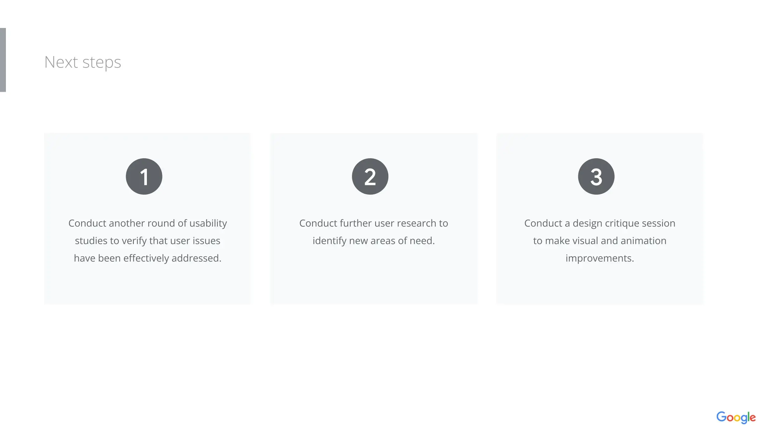
- Conduct a second round of usability testing with the high-fidelity prototype.
- Design a "Landlord Portal" to allow property owners to upload and verify their own listings.