REVIVE
category:
UX Design
Platform:
iPadOS
Tools Used:
Figma
Role:
UX Design Lead
Case Study: Revive – Digitizing Cardiac Life Support
HCA Healthcare, U.S.A
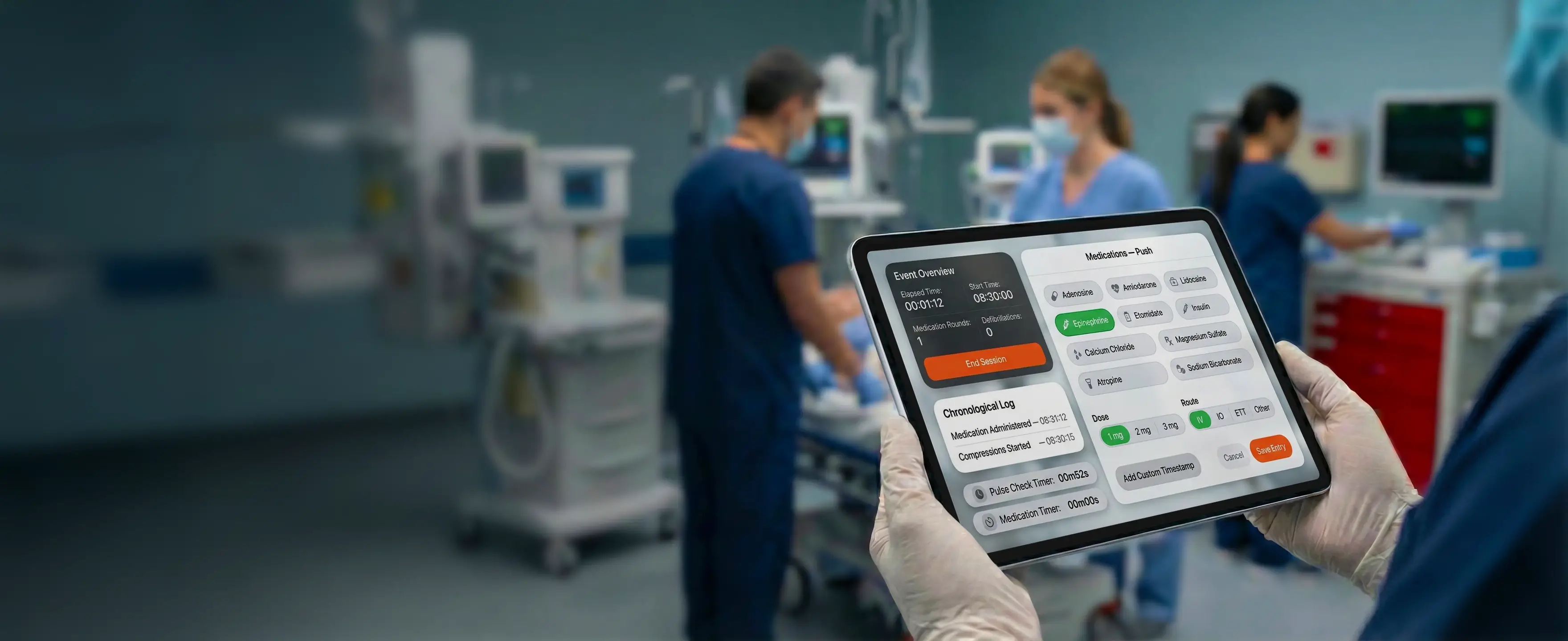
Revive is a specialized iPad application designed for HCA Healthcare clinical teams to document Code Blue (cardiac arrest) events in real-time. By replacing manual charting with a digital interface, the app improves accuracy and adherence to ACLS protocols through features like automated medication timers, synchronized CPR clocks, and quick-tap logging for vital interventions.

The Challenge
“Code Blue” events (cardiac arrest) are high-stress, chaotic environments where clinical teams must adhere to strict ACLS (Advanced Cardiovascular Life Support) protocols. traditionally, documentation is done via pen and paper by a dedicated “scribe.” This leads to timestamp errors, illegible notes, and missed protocol reminders (e.g., administering Epinephrine every 3-5 minutes).
The Solution
Revive is an iPad application designed to act as a digital scribe and decision-support tool. It assists the Code Team by automating timers, logging actions in real-time, and ensuring accurate documentation for the patient’s medical record.
The Problem Space
In a cardiac emergency, cognitive load is at its peak. The medical team faces several friction points:
Time Distortion: It is difficult to mentally track 2-minute CPR cycles or 3-minute medication intervals while performing life-saving measures.
Documentation Lag: Writing down actions often happens minutes after they occur, leading to inaccurate medical records.
Fragmented Data: Vitals, drugs, and interventions are often recorded in different places.
UX Strategy & Design Principles
Speed & Fitts’s Law
Cognitive Offloading via Split-Screen
Error Prevention & Recovery
Given the urgency of the environment, fine motor skills are compromised.
Design Decision: I utilized Massive Touch Targets. The primary actions (Compressions, Medications, Defibrillation) are large, card-based buttons that are impossible to miss.
Grid Layout: Medications are laid out in a clear grid rather than a scroll wheel or dropdown, allowing for "one-tap" selection.
The interface is divided into two distinct functional areas to manage attention:
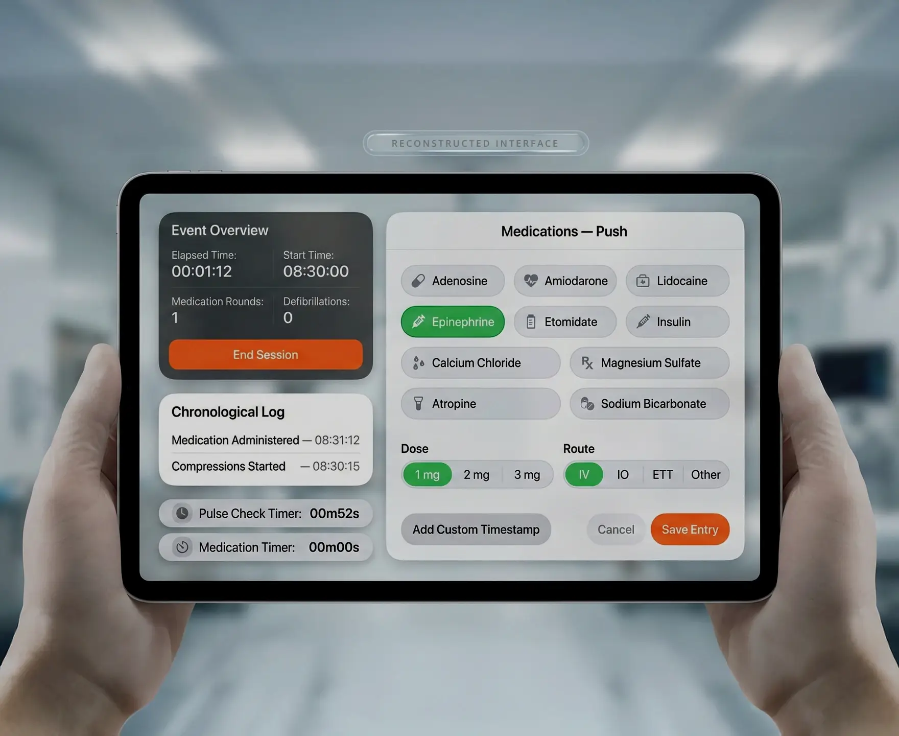
- The "Status" Rail (Left - Dark Mode): This area remains static. It houses the Chronological Log, the Total Elapsed Time, and critical Protocol Timers (Epinephrine and Pulse Check). The dark background visually recedes, allowing it to be referenced at a glance without distracting from the active task.
- The "Action" Canvas (Right - Light Mode): This is the active workspace where the user inputs data. The high contrast white background signifies "Input Required."
- Smart Defaults: When a medication like Epinephrine is selected, the standard dose (1mg) and route (IV) are pre-selected to speed up the workflow, but can be easily toggled.
- Destructive Actions: The "End Code" button is isolated in red/orange, distinct from the blue workflow buttons, preventing accidental closure of the session.
Key Feature Deep Dive
The Dashboard (Start State)
Real-Time Protocol Timers
Medication Administration Flow
The Pulse Check Logic
The "Start Code" screen is intentionally sparse. It features a singular, high-prominence primary action button. This ensures that when the iPad is grabbed from the crash cart, there is zero confusion on how to begin the timer.
Visuals: Located in the bottom left corner.
Function: These timers are linked to ACLS algorithms.
Pulse Check Timer: Counts down the 2-minute CPR cycle.
Epinephrine Timer: Tracks the 3-5 minute dosing window.
UX Win: This transforms the app from a passive recorder into an active coach, reminding the scribe when the next intervention is due.
- Context: Administering drugs is the most frequent data entry task.
- Design: We flattened the architecture. instead of navigating deep menus, the user sees:
- Drug Selection: (e.g., Epinephrine, Amiodarone).
- Dose & Route: (e.g., 1mg, IV).
- Confirmation: A clear "Save Progress" button.
- Result: A medication can be logged in under 3 seconds.
The "Pulse Check" screen facilitates complex decision-making.
- Rhythm Identification: Large toggles for VT (Ventricular Tachycardia), VF, Asys (Asystole), and PEA allow the scribe to quickly categorize the patient's status.
- Decision Tree: Based on the rhythm selected, the app implicitly guides the next step (e.g., Shock vs. Resume Compressions).
Visual Design System
The UI adheres to a clean, clinical aesthetic tailored for readability under harsh hospital lighting.
Typography: highly legible sans-serif fonts (likely Inter or Roboto) with tabular figures for numbers to prevent jittering timers.
Color Palette:
Orange: Critical/Primary Actions (HCA Brand Alignment).
Green: Success/Active Selection (Epinephrine toggle).
Dark Blue/Navy: Global Navigation and Status (Stability).
White/Gray: Backgrounds for readability.
Outcomes & Impact
By switching from paper to the Revive iPad App, the Code Blue process sees:
- 100% Timestamp Accuracy: Every action is logged to the exact second it was tapped.
- Improved Protocol Adherence: Visual timers reduce the cognitive load on the Team Leader.
- Seamless Handover: The digital log can be immediately exported to the patient's Electronic Health Record (EHR) or printed for the debriefing.